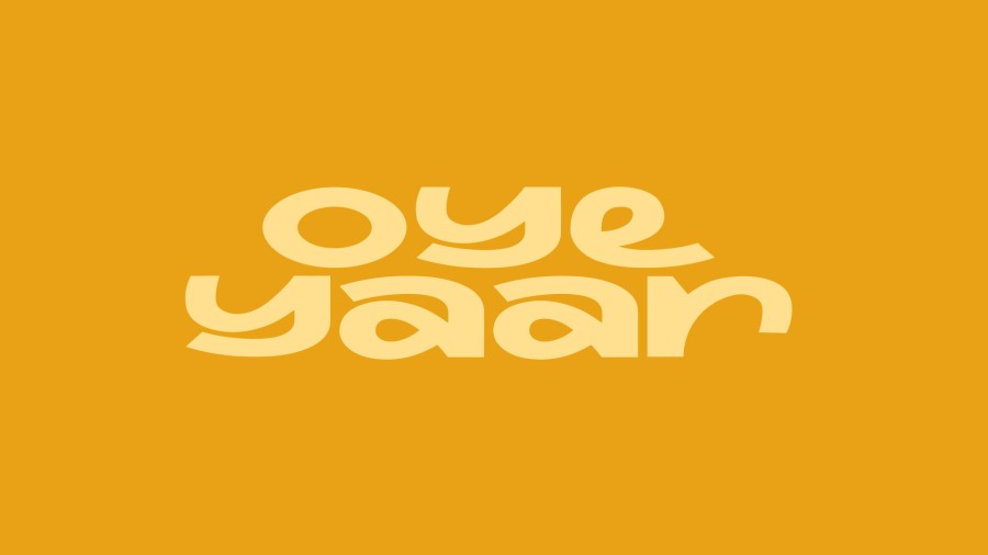
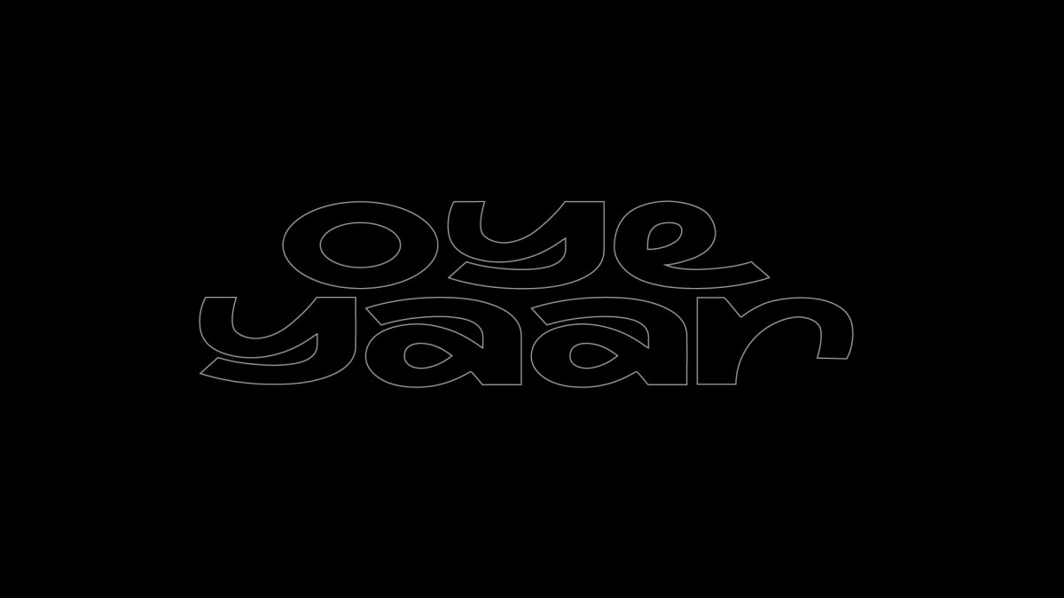
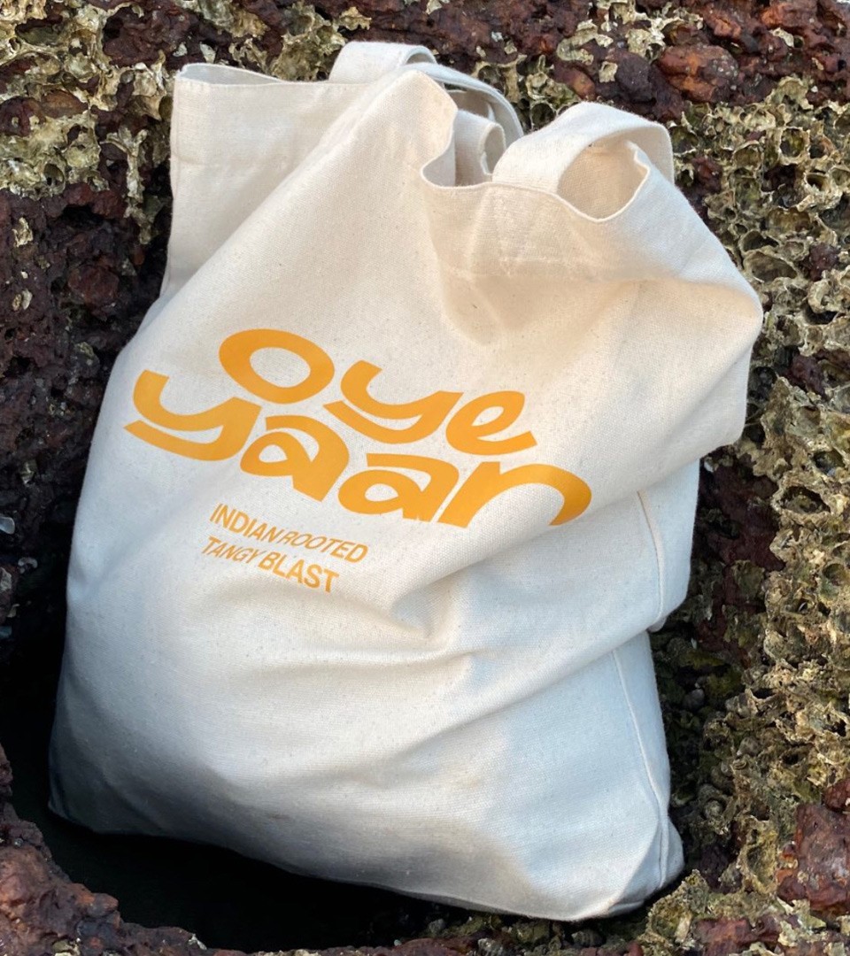
OYE YAAR
— Crafting originality for Indian rooted drink
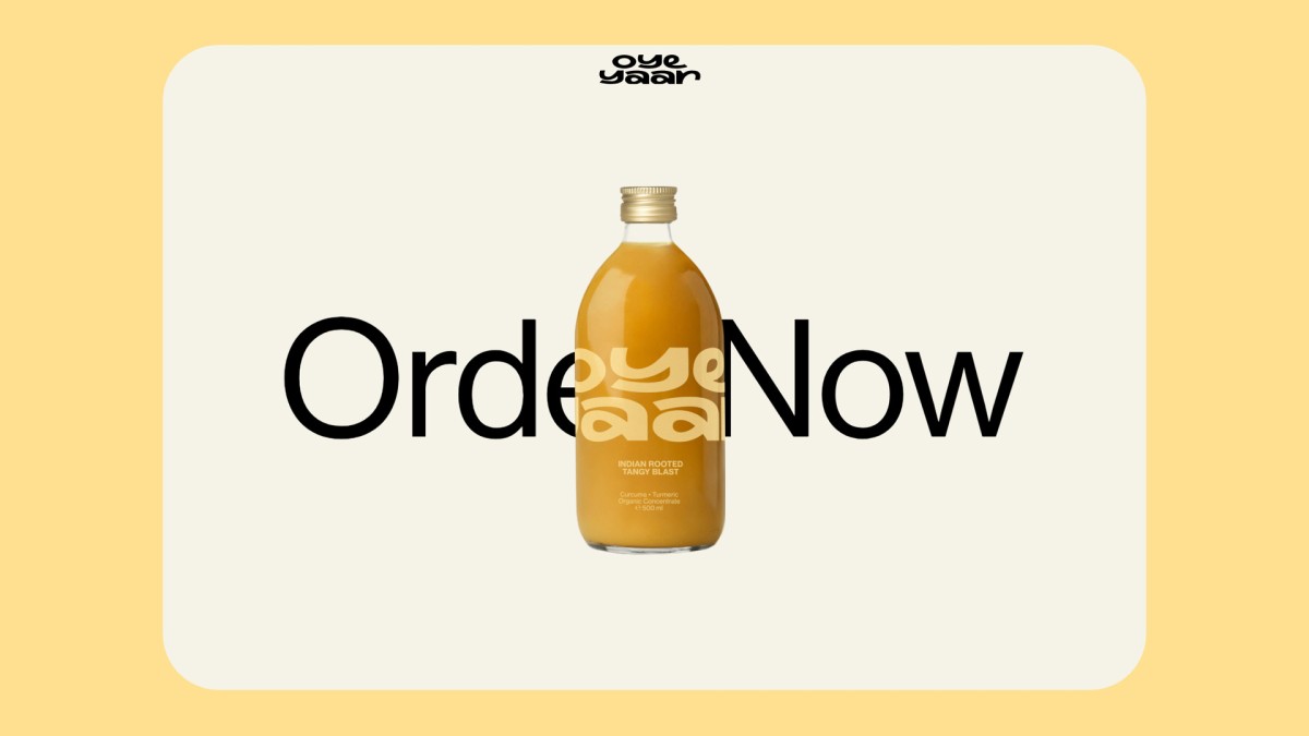
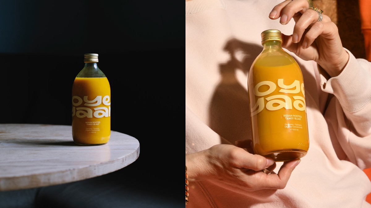
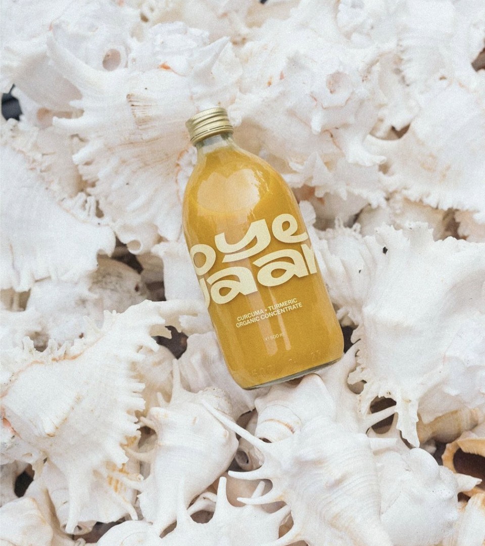
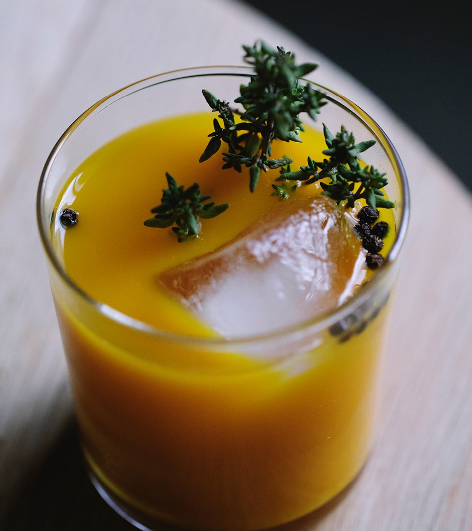
Oye Yaar is an Indian Rooted Tumeric drink. Healthy and non-alcoholic, a great alternative for cocktail mixes. In Hindi, the word ‘yaar’ has two meanings : “friend” and “lover”. An identity with indian roots.
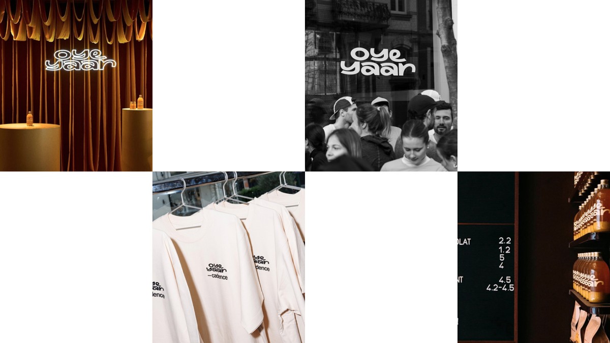
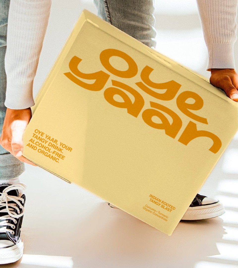
Inspired by the Hindi alphabet, the Oye yaar logo design is an ode to a vibrant contemporary culture with traditional roots.

The meticulous crafting of a unique typeface allows for the distillation of brand identity into a tangible visual element, transcending mere aesthetics to convey deeper layers of meaning and cultural resonance. For instance, leveraging the Hindi alphabet to design a typeface for a brand inspired by India not only pays homage to the country's rich heritage but also serves as a powerful symbol of authenticity and cultural affinity.
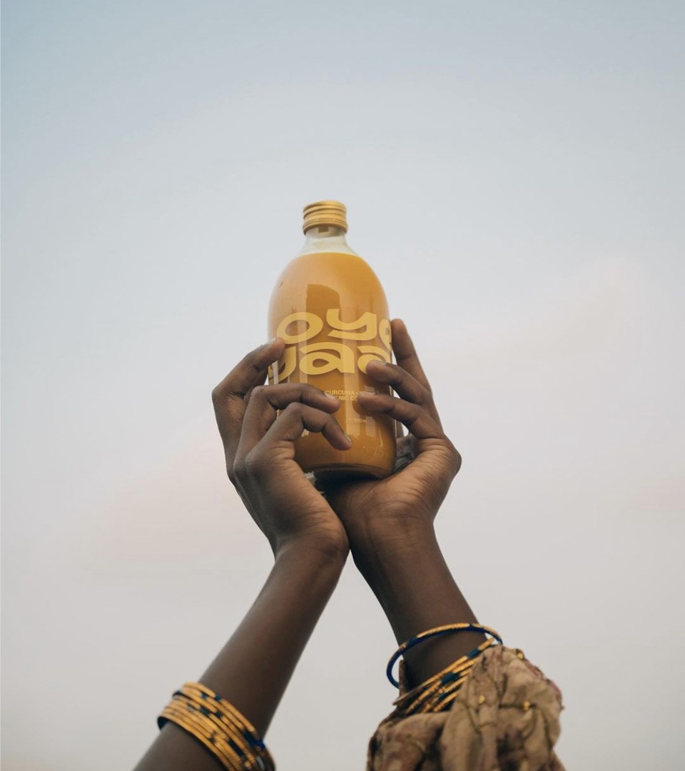
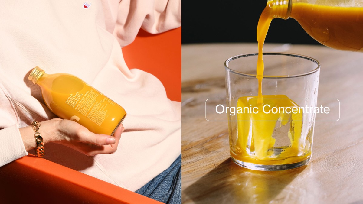
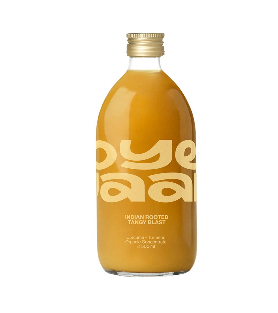
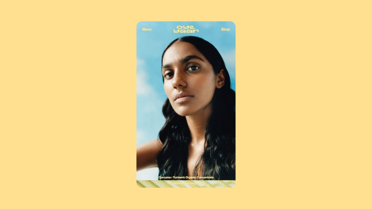
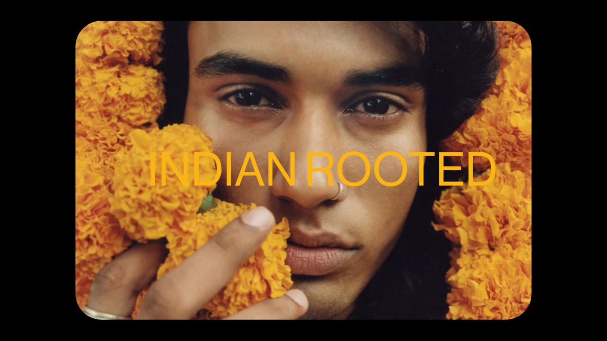
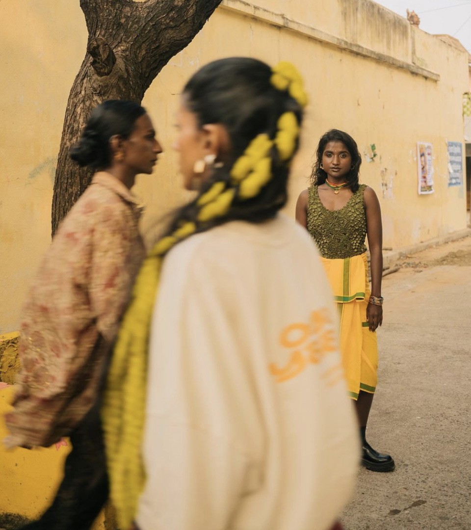
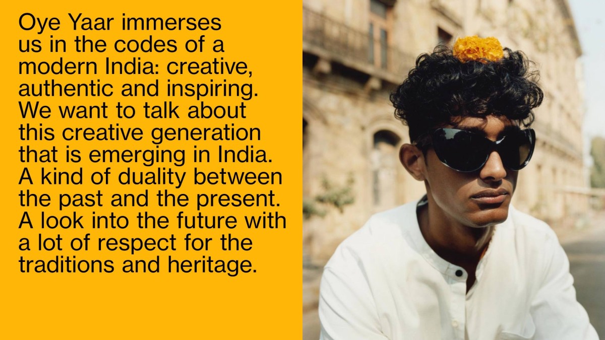
Using yellow as a brand color to evoke the vibrancy of curcuma, a potent spice synonymous with India's rich culinary heritage. Coupled with imagery of Indian people, it encapsulates the essence of the country's culture, infusing the drink brand with an authentic and evocative ambiance.