Opera National de Lorraine
Branding, Creative direction & Communication for french Opera House
Located in the city of Nancy in the French province of Lorraine, the institution is the fifth national Opera in France. With a strong programmation and a new direction, we worked with them to create a new proposition as a open house of creation, with a new attitude.
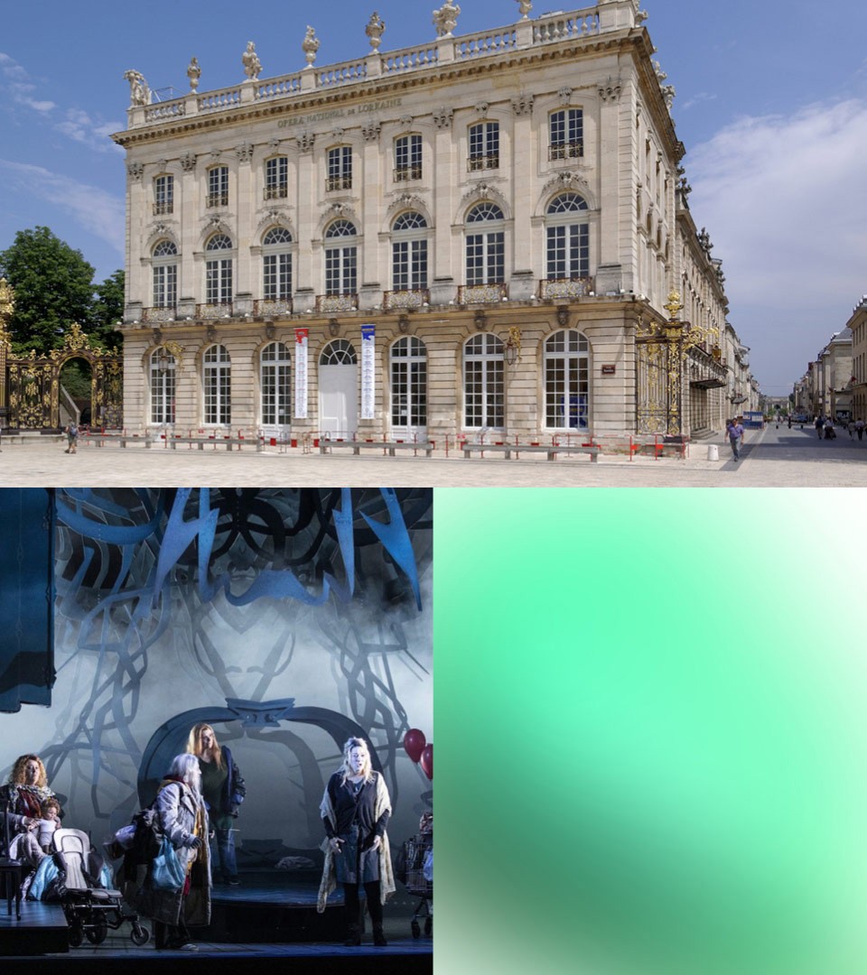
The Opera, an institution located on one of the most beautiful square of France
Formerly named the Opéra de Nancy et de Lorraine, it was given the status of national opera in 2006. The company’s original theatre was constructed during the reign of the King of Poland and Duke of Lorraine, Stanislas Leszczyński in 1758. This theatre, located behind the Museum of Fine Arts, was destroyed by fire in October 1905 and a new opera house was constructed in its present location on the Place Stanislas by Joseph Hornecker and was inaugurated in 1919. Joseph Hornecker, a member of the School of Nancy, created the opera house in the classical style combined with the characteristics of “art nouveau”. The work done in Nancy made it a center of art and architecture that rivaled Paris and helped give the city the nickname “Capitale de l’Est.”
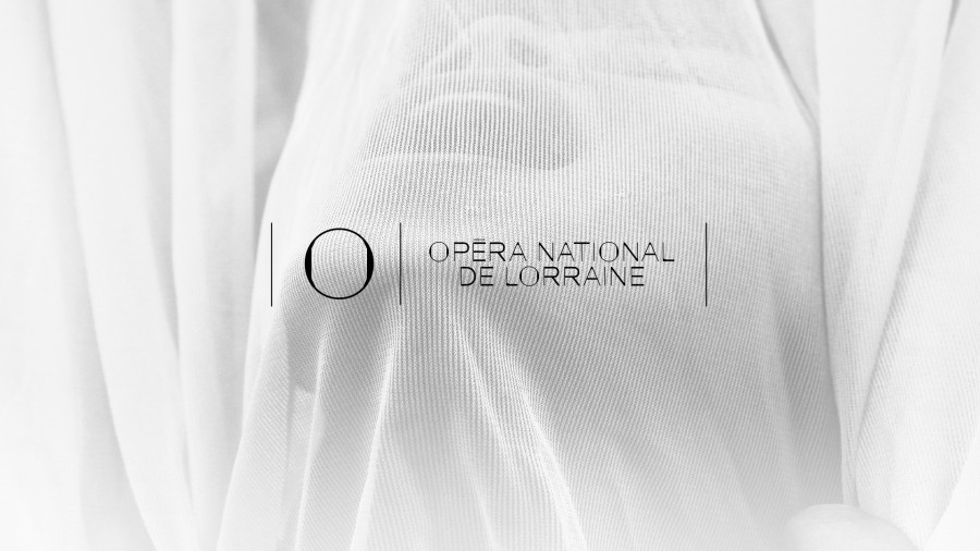
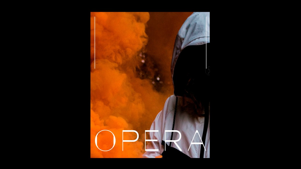
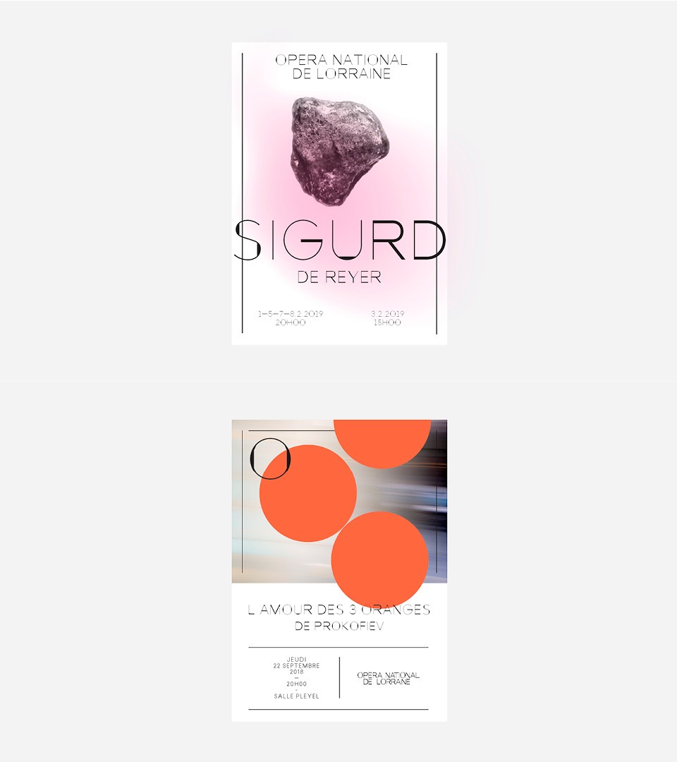
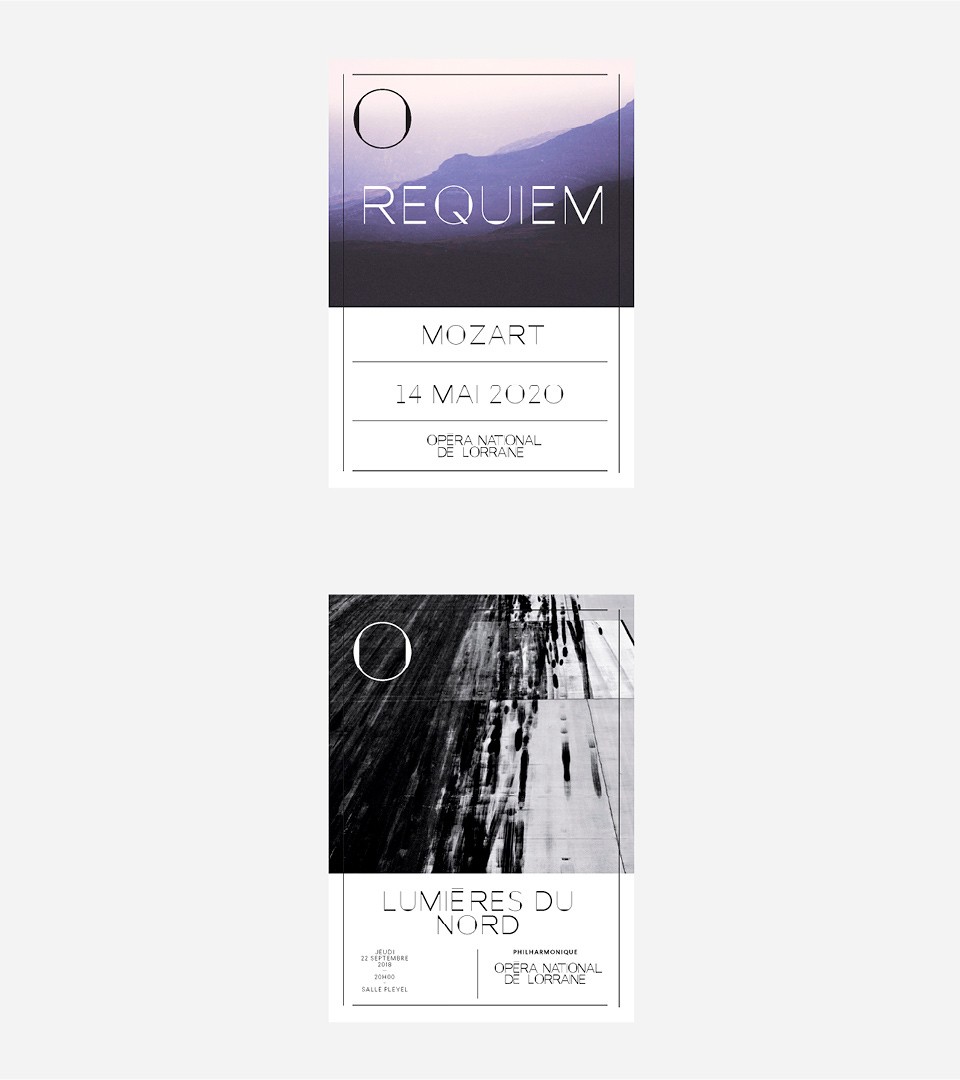
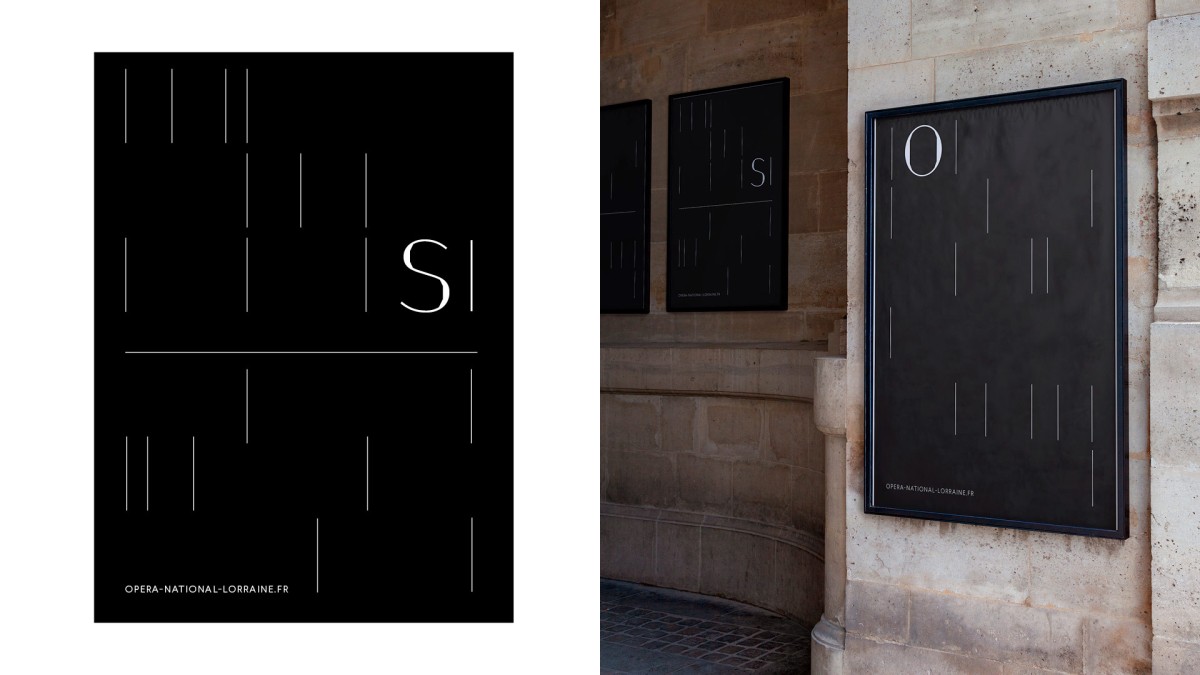
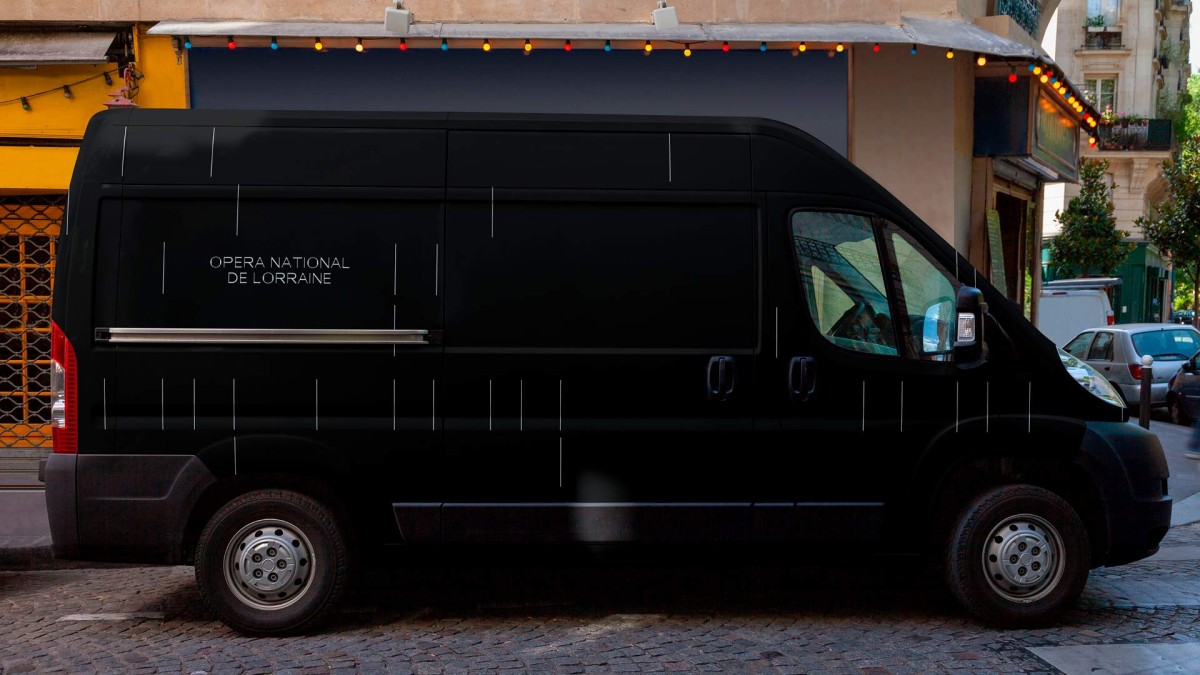
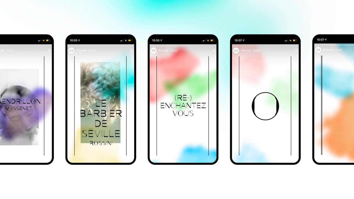
The identity : The voice of location
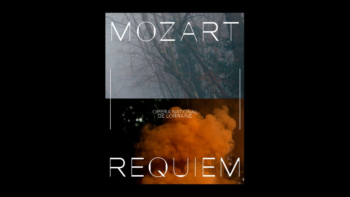
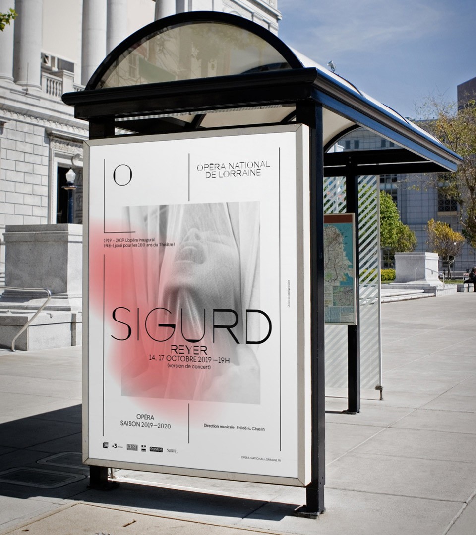
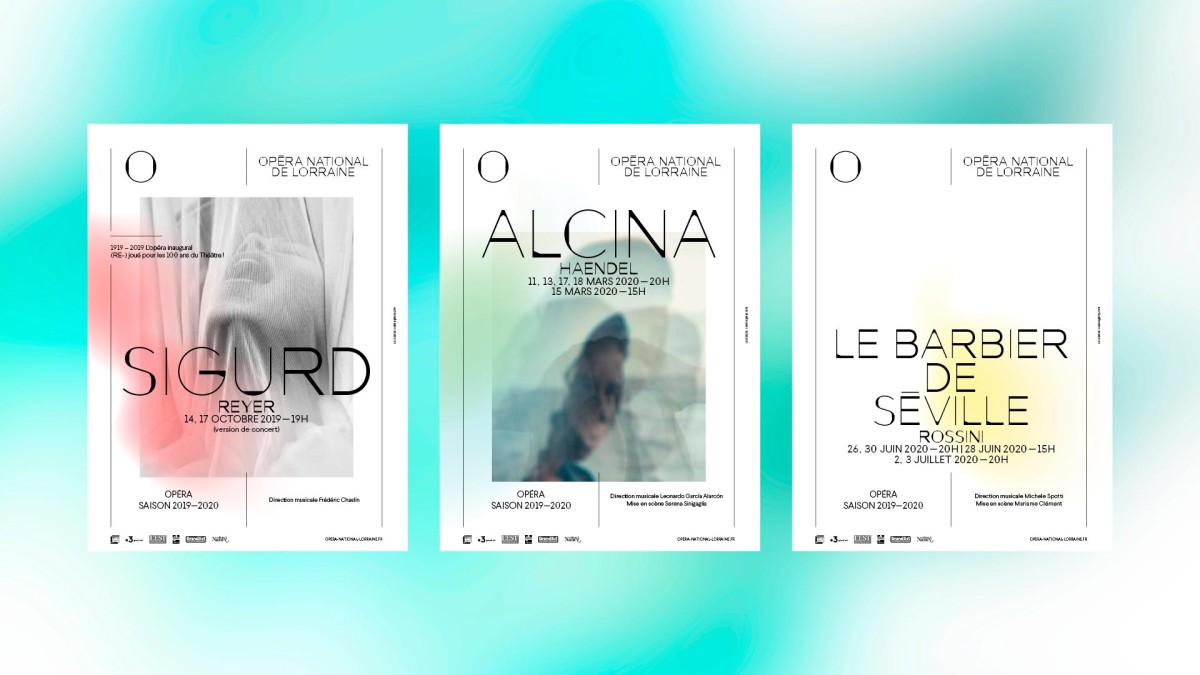
Located on one of France's most beautiful squares, we designed the identity using the Place Stanislas as reference. Two lines translating the square limits and the Uppercase O form the design vocabulary.
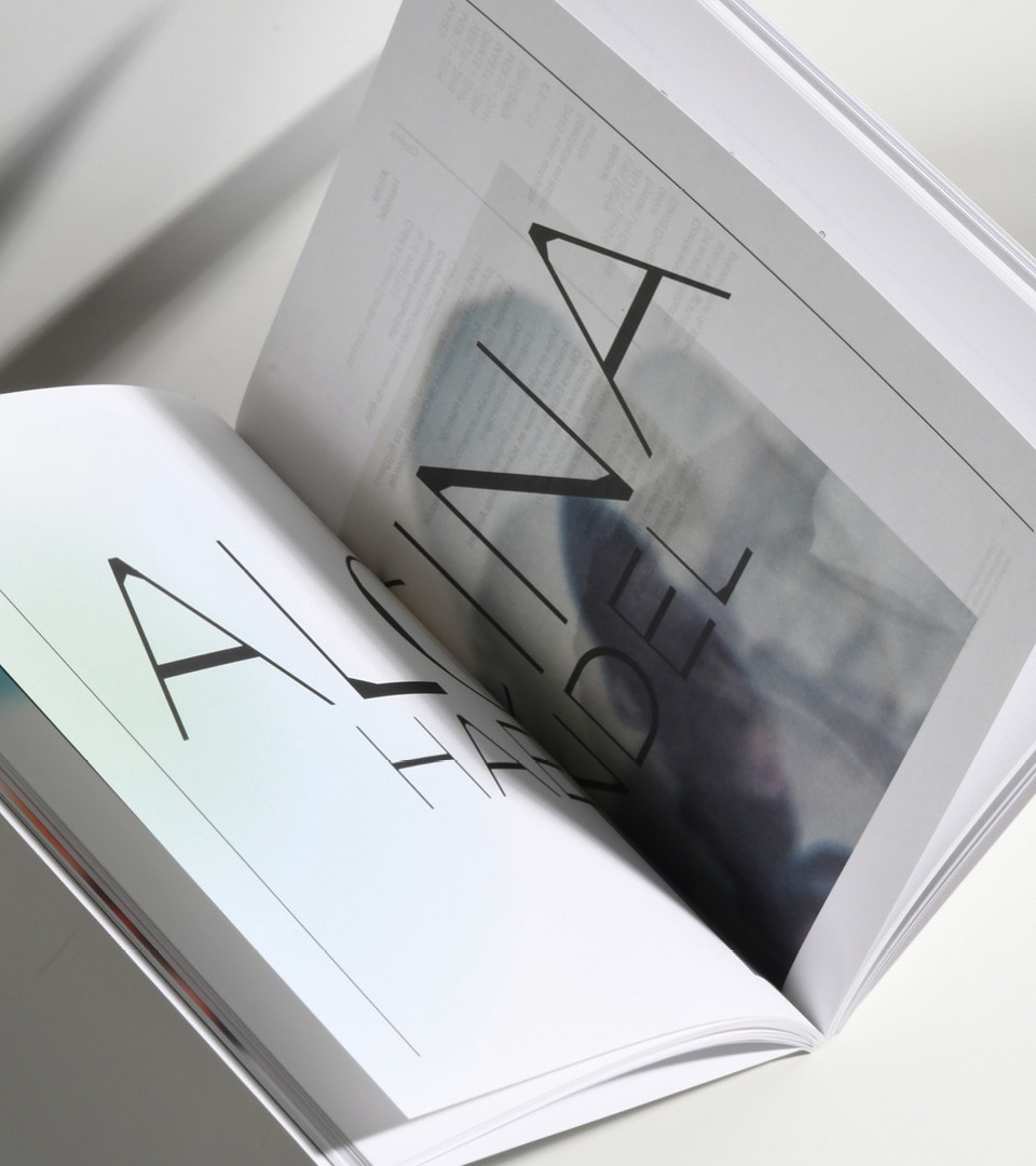
The Layout system is a translation of the Place Stanislas grid and a reference to musical notes and rythm. Lines play the rythm role and provide a graphic design playground.
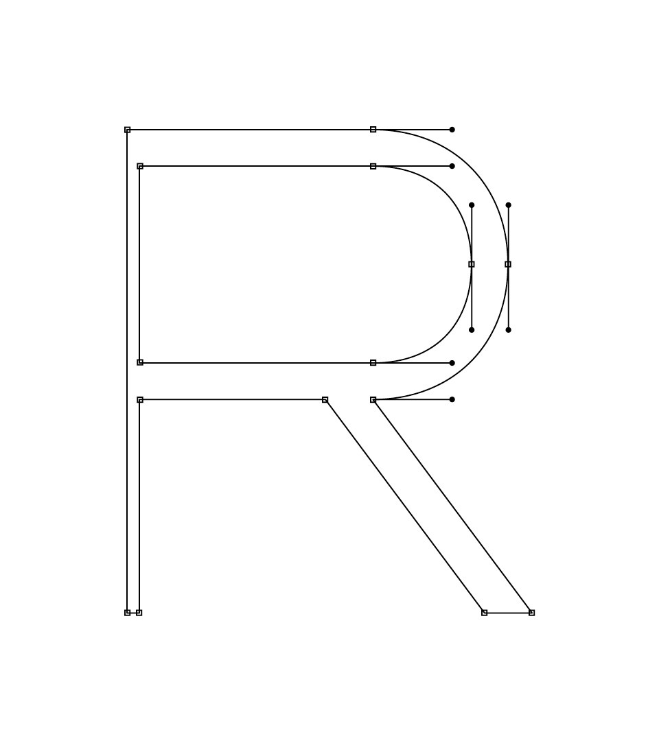
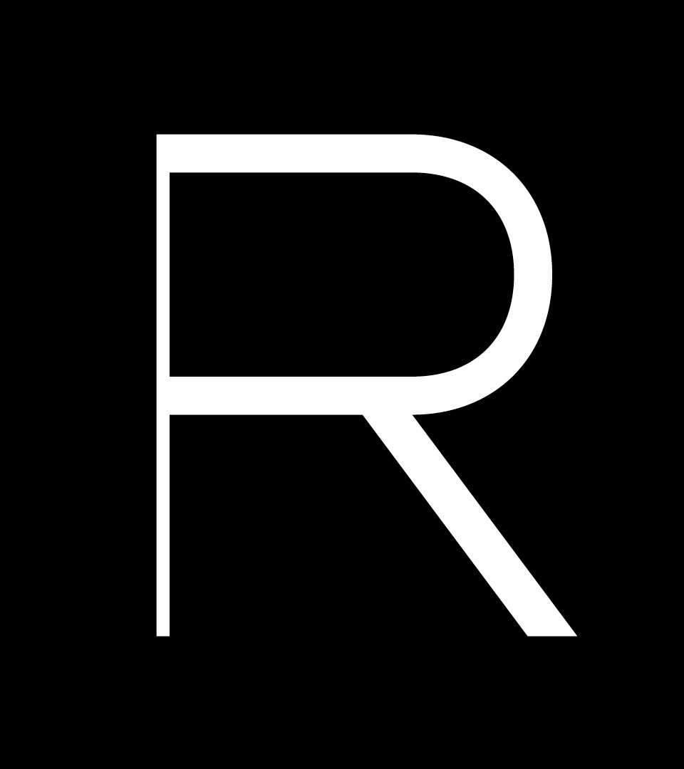
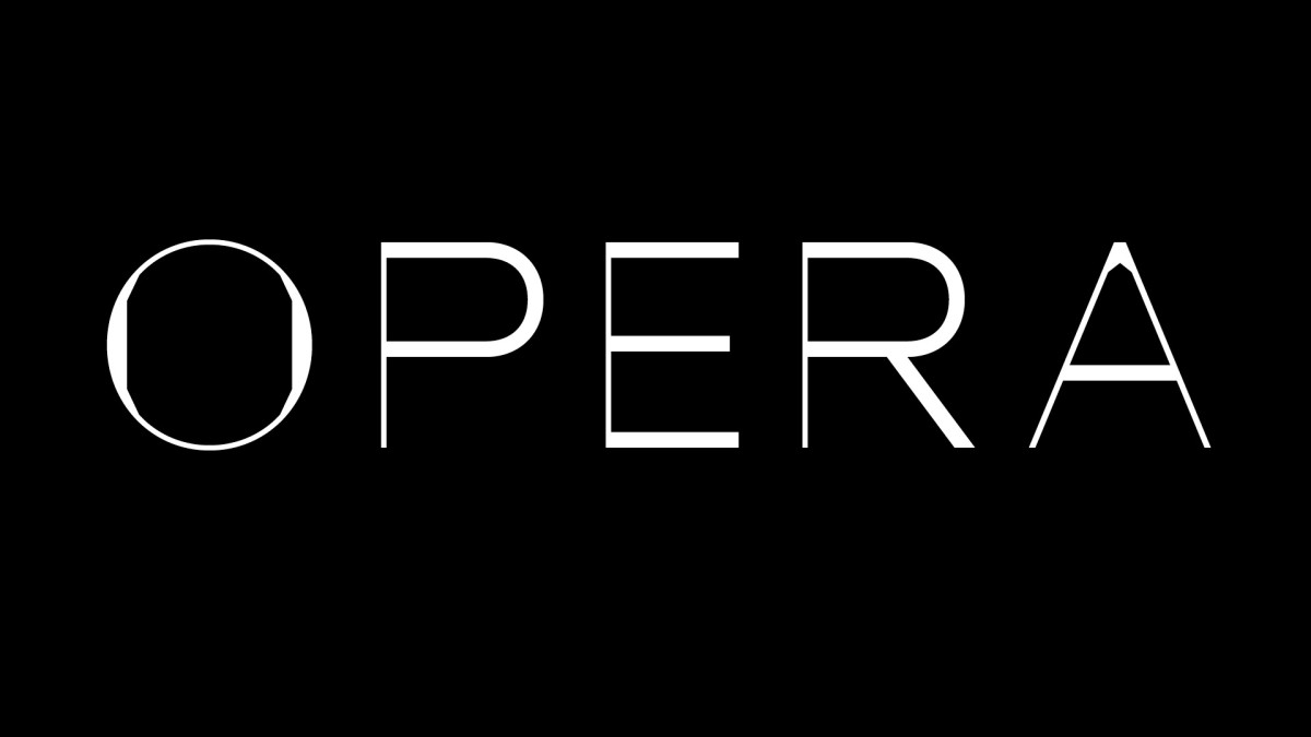
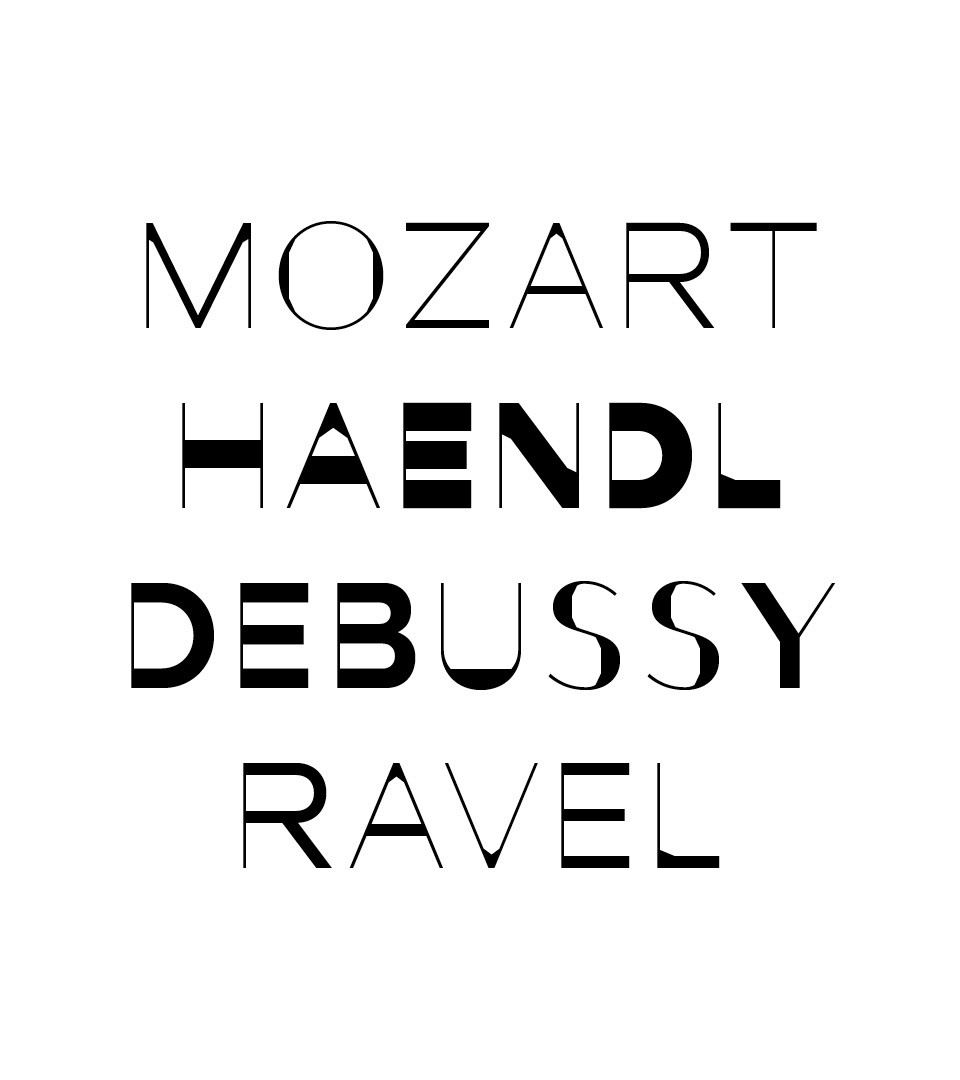
A custom typeface between Art Nouveau and Art Lyrique
The font design was conducted by our team to highlight the institution's purpose: position the institution as a space for creation in Opera and Music. The typeface was designed also as a reminder of Nancy, capital of Art Nouveau & ironworks.
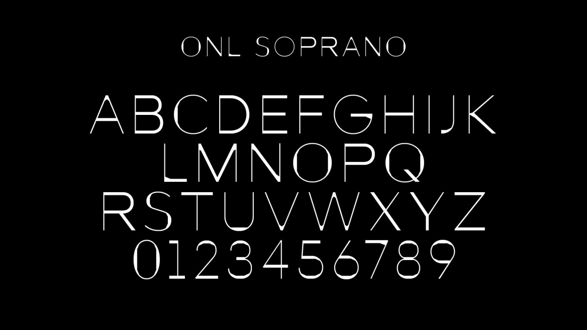
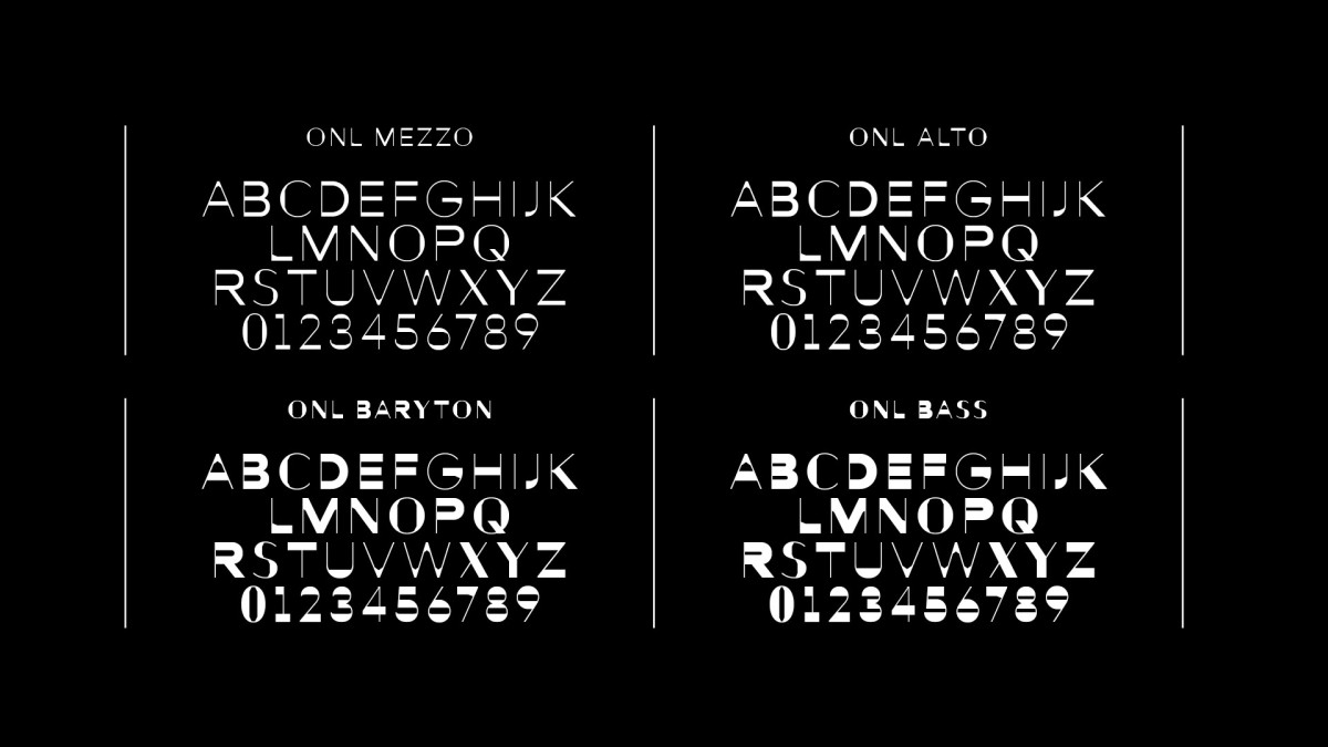
The identity system combines local heritage with an original layout & custom typeface. The system has been designed for maximum flexibility.
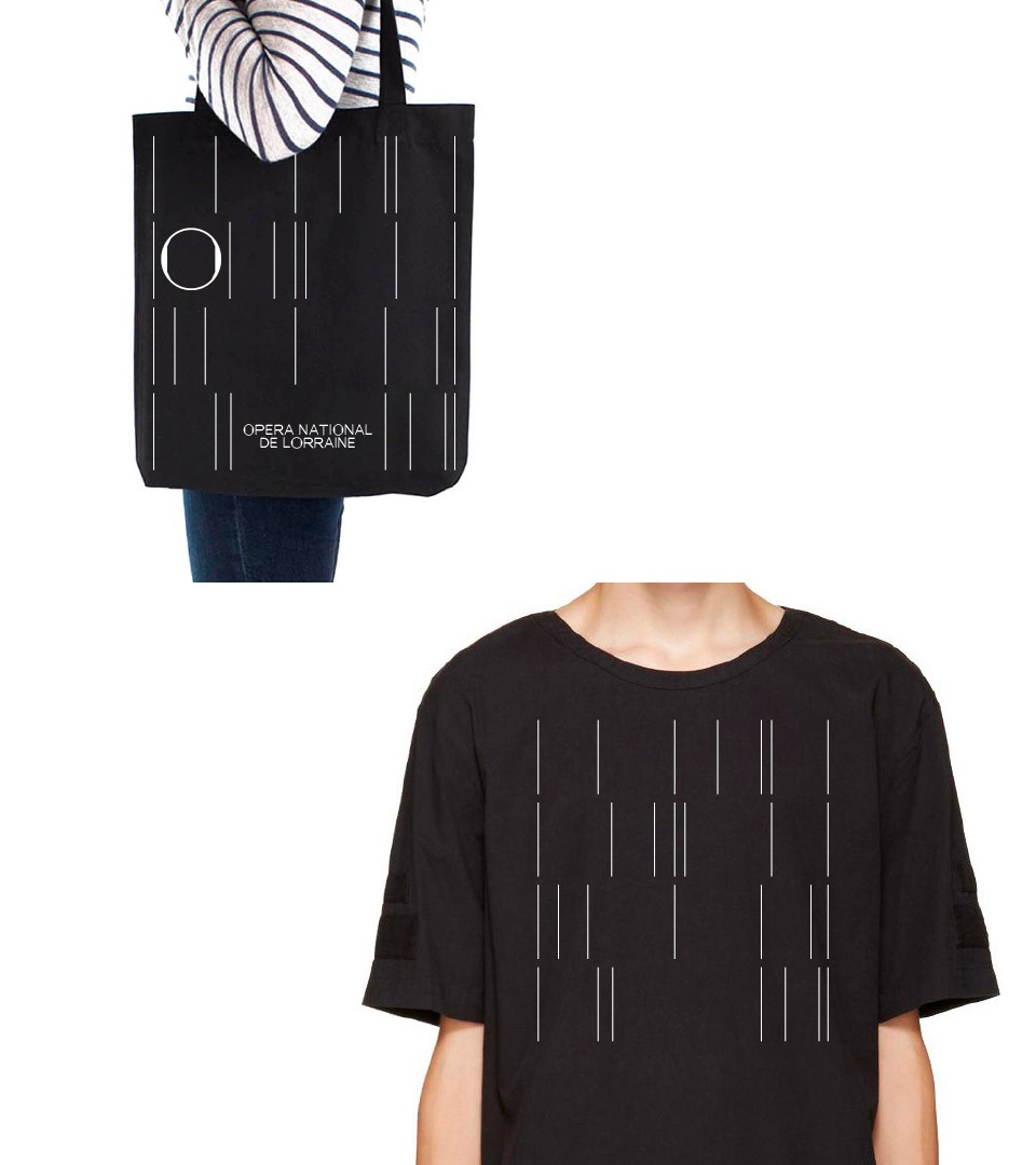
Shop Opera
A limited edition of items have been produced to highlight the new corporate identity. Among different types of items, a tote bag, an umbrella and spectacles.
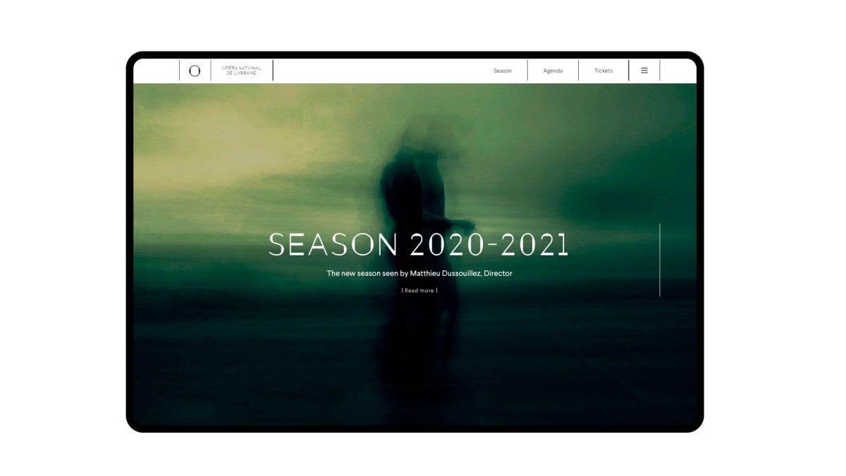
A first new season of the National Opera re-birth. Under one sentence, we summarized the new state of mind and inspiration within the cultural institution.
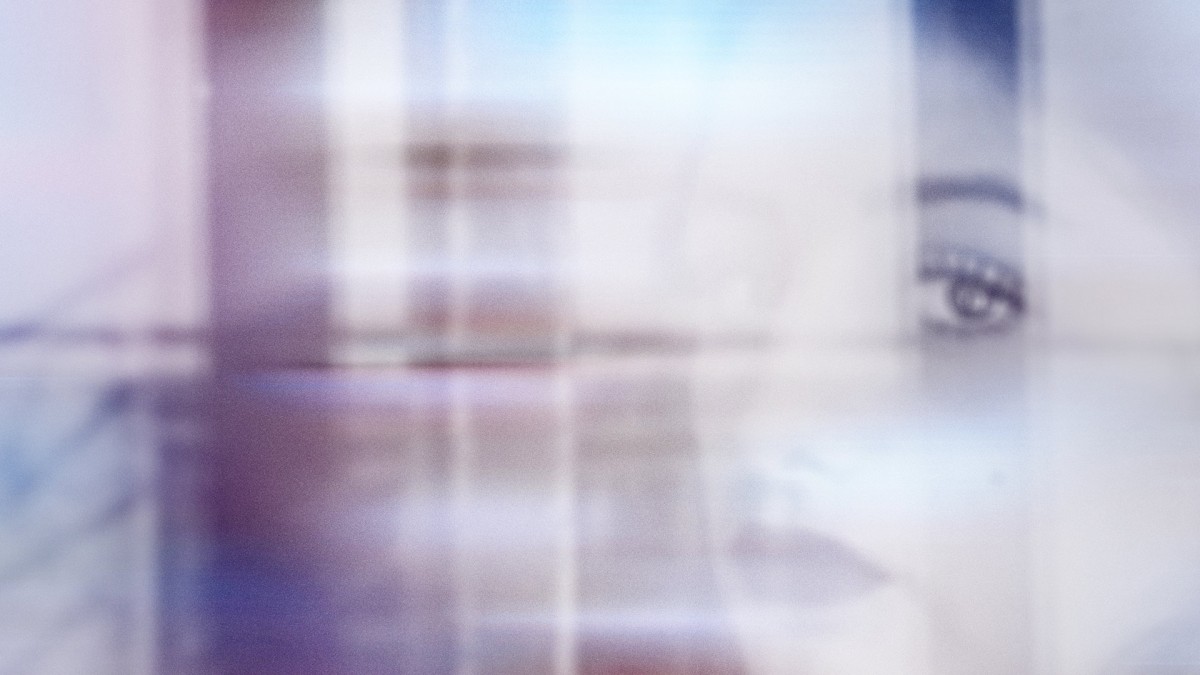
A visual universe about new discoveries with women playing the central role
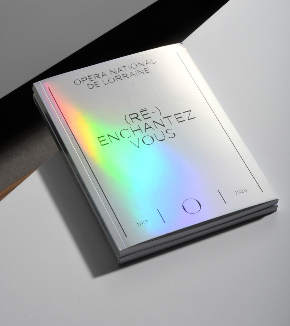
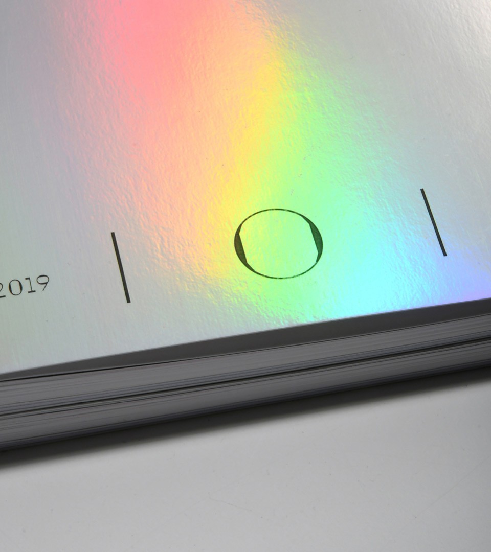
To reinforce the season's theme, the cover of the season's program was printed using iridescent paper
For 2020-2021, “transfigure the night” was the central theme of the season. We worked on a visual approach on the transformations occuring during the night, between dusk and dawn, between reality and dreams.