KANAL CENTRE POMPIDOU
— 35,000 SQM Cultural Institution branding
A 35,000 Sqm space devoted to culture, Kanal – Centre Pompidou, opened its doors in May 2018 to allow the public to discover an exceptional cultural heritage hosting several exhibitions mixing visual arts, design, architecture, performances and major installations.
Branding cultural mammoth in the heart of Brussels.
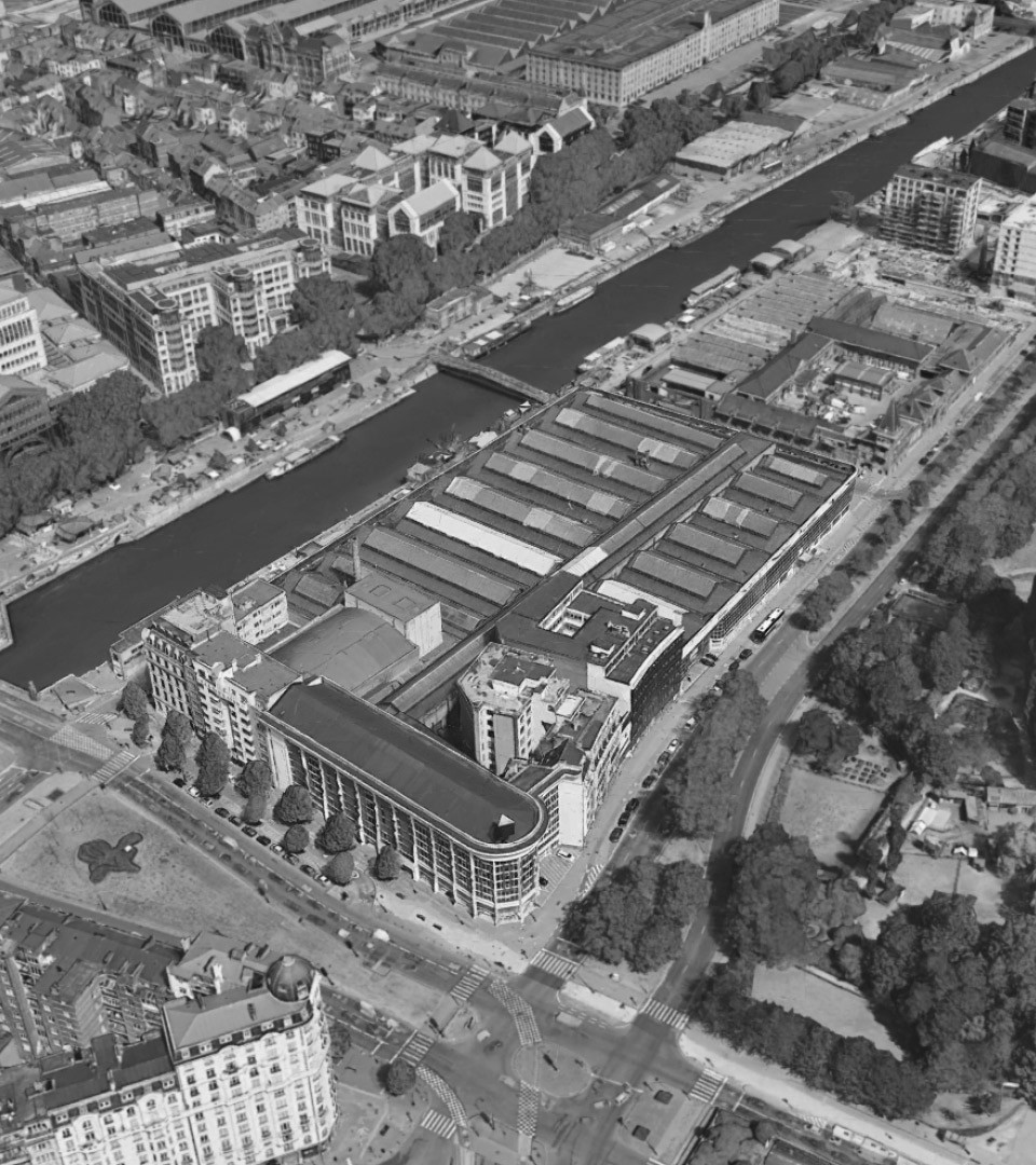
Located in central Brussels, the complex occupies the former Citroën Plant which would be, for a long time, the largest in Europe. A huge complex essentially made of glass, steel and concrete, aiming at capturing the modernist spirit of the time. After World War II, the showroom was subdivided into additional levels in order to increase the space required for the works in the garage.
The latter later replaced production activities until the building closed down in 2015. All these operations, from building cars to selling and repairing them, left traces behind: markings on the ground, Citroen logos in the showroom, security problems of all kinds, and different signage for different time periods.
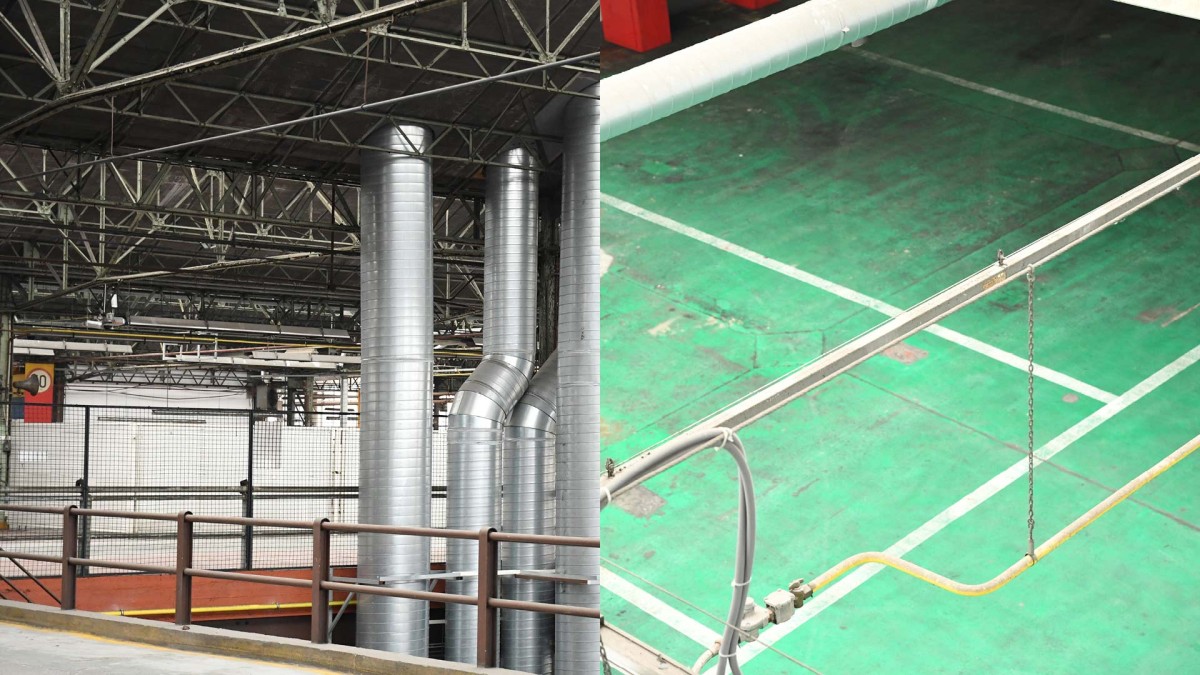
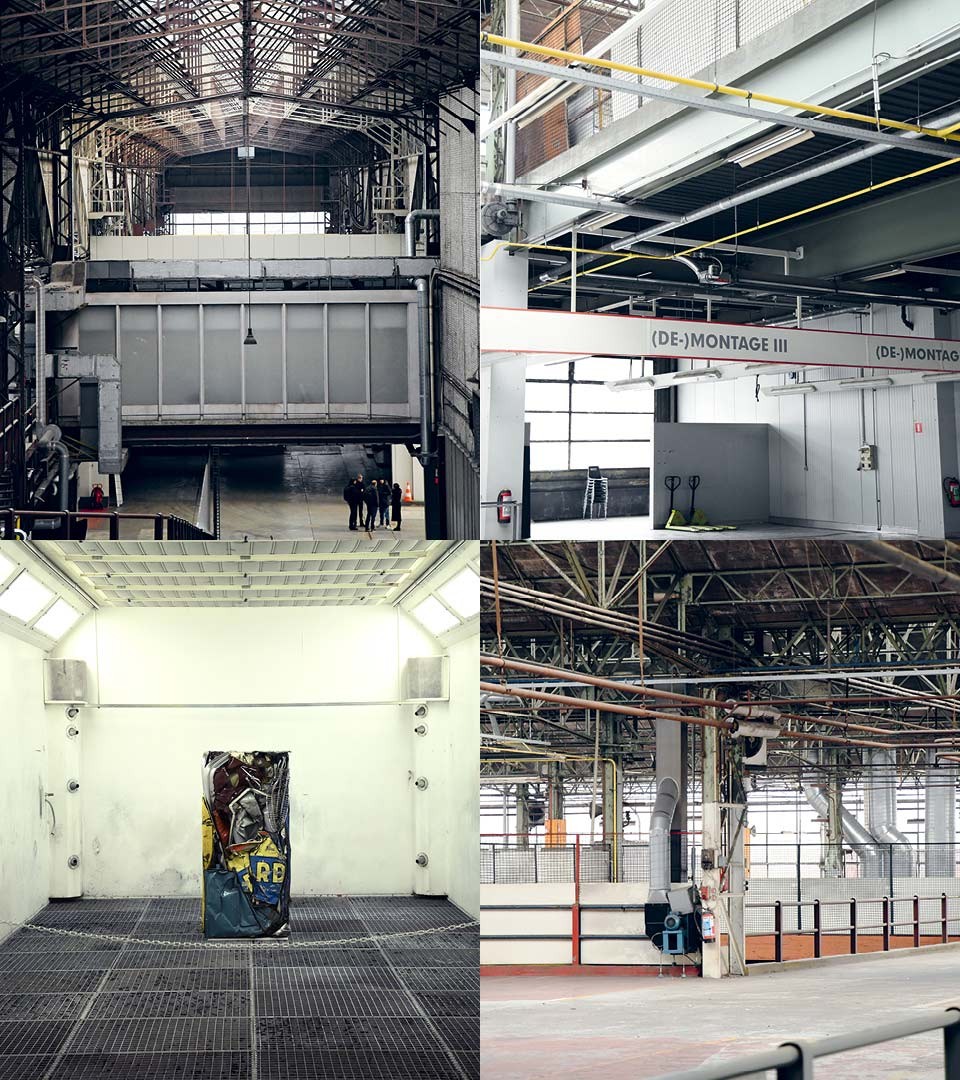
A contemporary exhibition space in a RAW environment
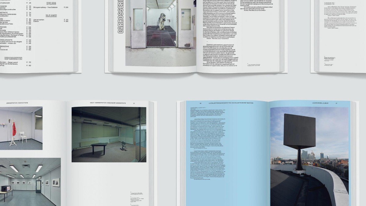
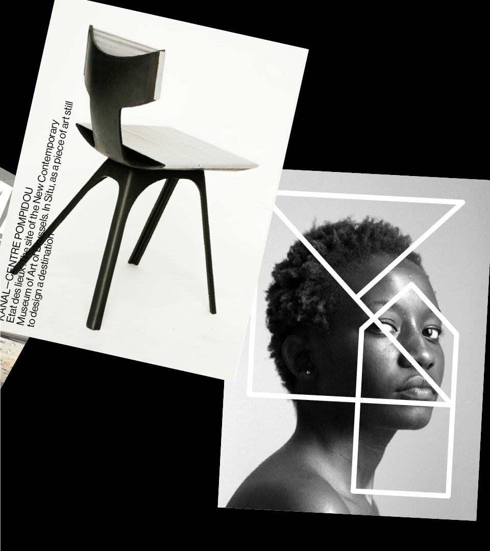
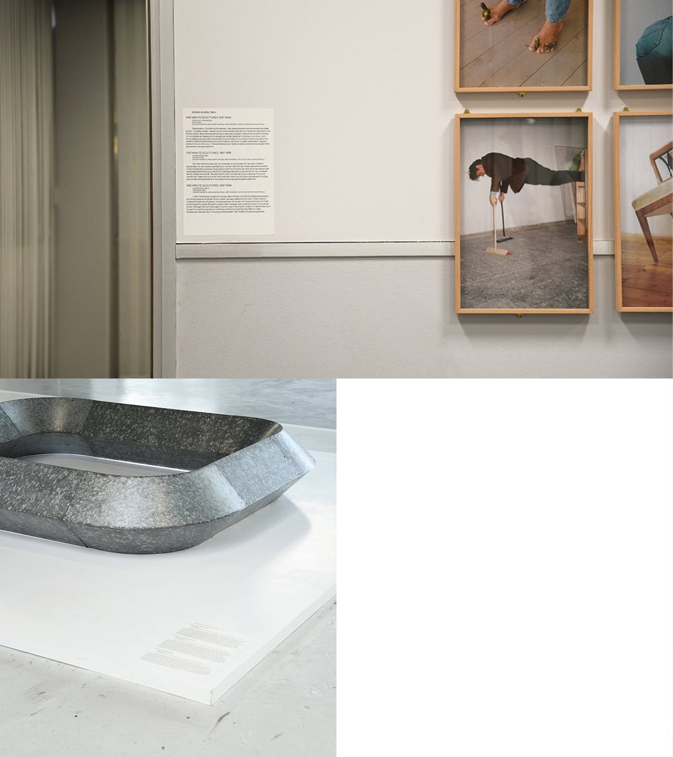
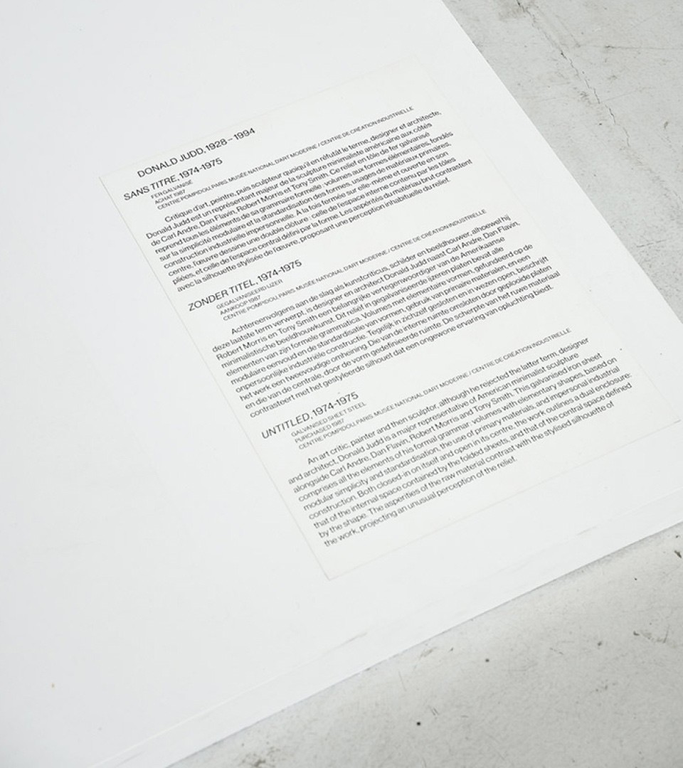
The artistic program is thematically close to the purpose of the original place. Avoiding conventional museum exhibition design, the Centre Pompidou team proposes an experimental in situ program, where works of art create a dialogue between the location and art. The different rooms of the building, originally a car garage, are also left as they are: the bodywork unit will welcome sculptural works (for example a compressed César in the workshop’s painting booth), and the administration department hosts paintings, photos and audiovisual installations. The 35,000 square meters are also used for artistic and musical performances.
Inspired by the origins of the location and the mix of artistic expressions, we’ve created an identity system fusioning Artist/Experiment/Culture & Industry. For us, merging content and identity was a goal. We wanted artists, exhibits and Kanal to feel and communicate as one.
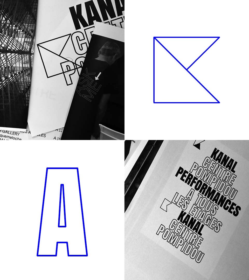
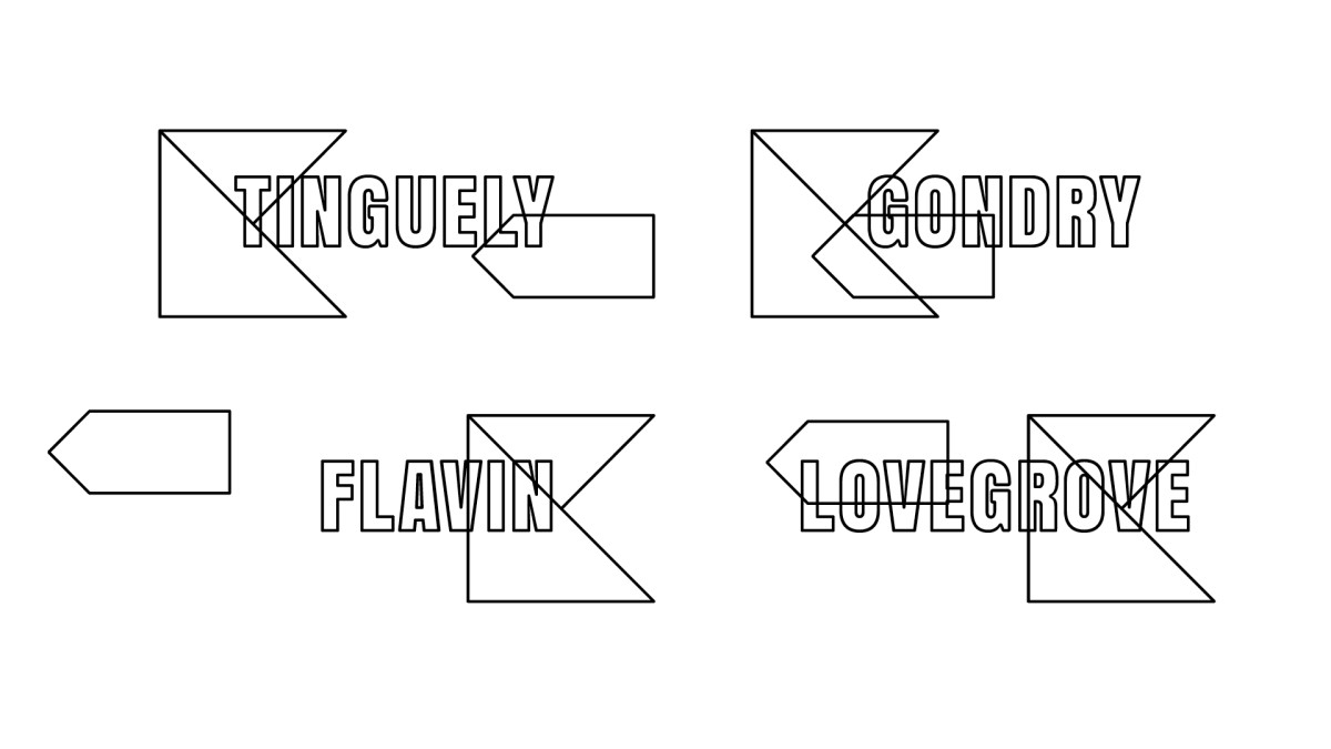
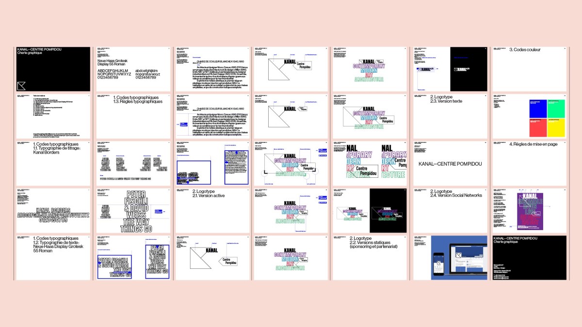
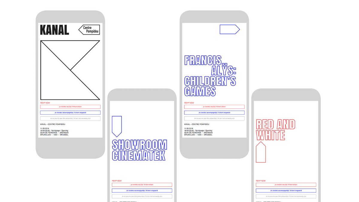
From digital experimentations to the definition of an icon and a custom made typeface
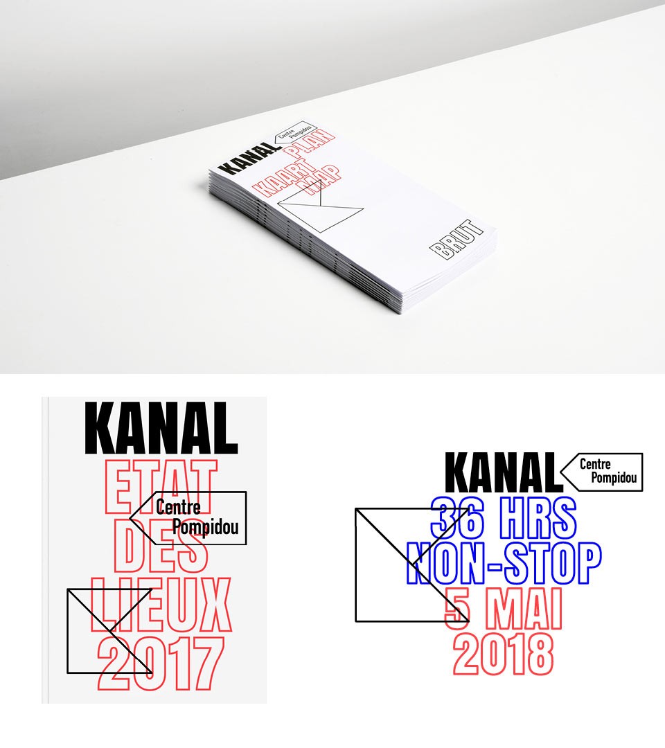
Our work was to define a consistent identity flexible enough to encourage all sorts of artistic expression, while keeping its RAW edges, like an informative expression of the building. With the icon and language, everything was possible. The typeface was called KANAL BORDERS, limiting the space like an island.
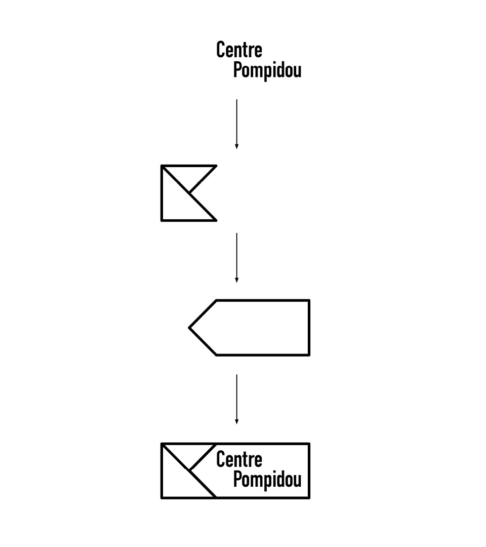
The Logotype : A symbol of partnership
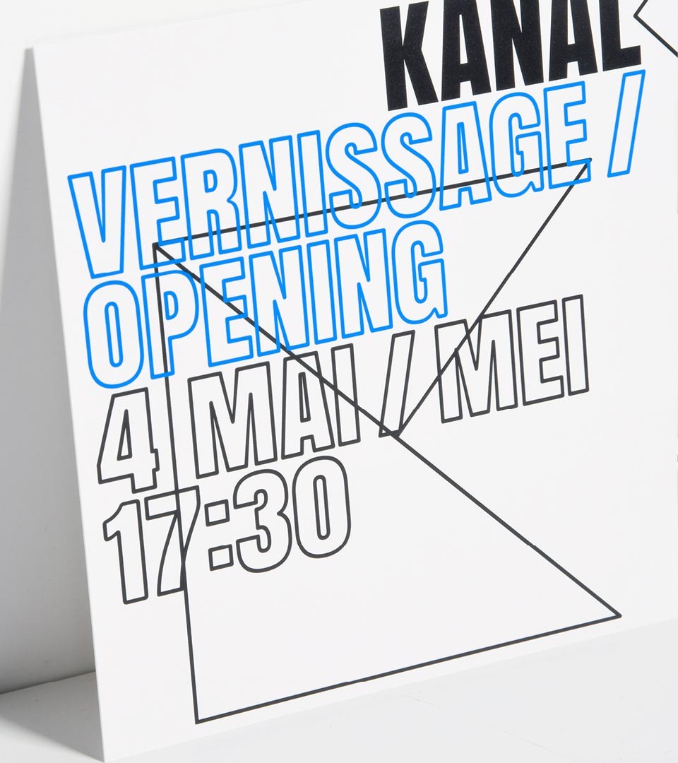
The museum pre-opened on May 4 2018, as part of a first phase of exhibitions called “Kanal Brut”, in a non-renovated building but totally secure. The works exhibited mostly came from the Centre Pompidou collection. Together, Kanal and The Centre Pompidou have secured a partnership for 10 years. The logotype symbolises this “partnership”.
An identity merging content and voice
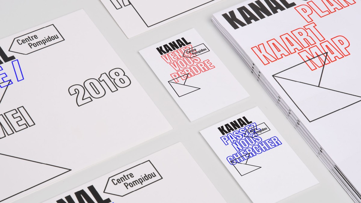
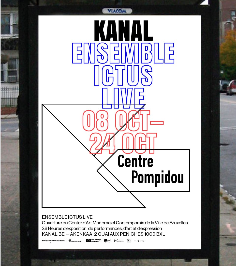
The logotype is the definition of the space and within our system it works as a global communication tool. From information to visitors to campaigns, all elements are set under 3 rules : the use of the Kanal Borders typeface, the graphical playground using the logotype shapes and a central layout.
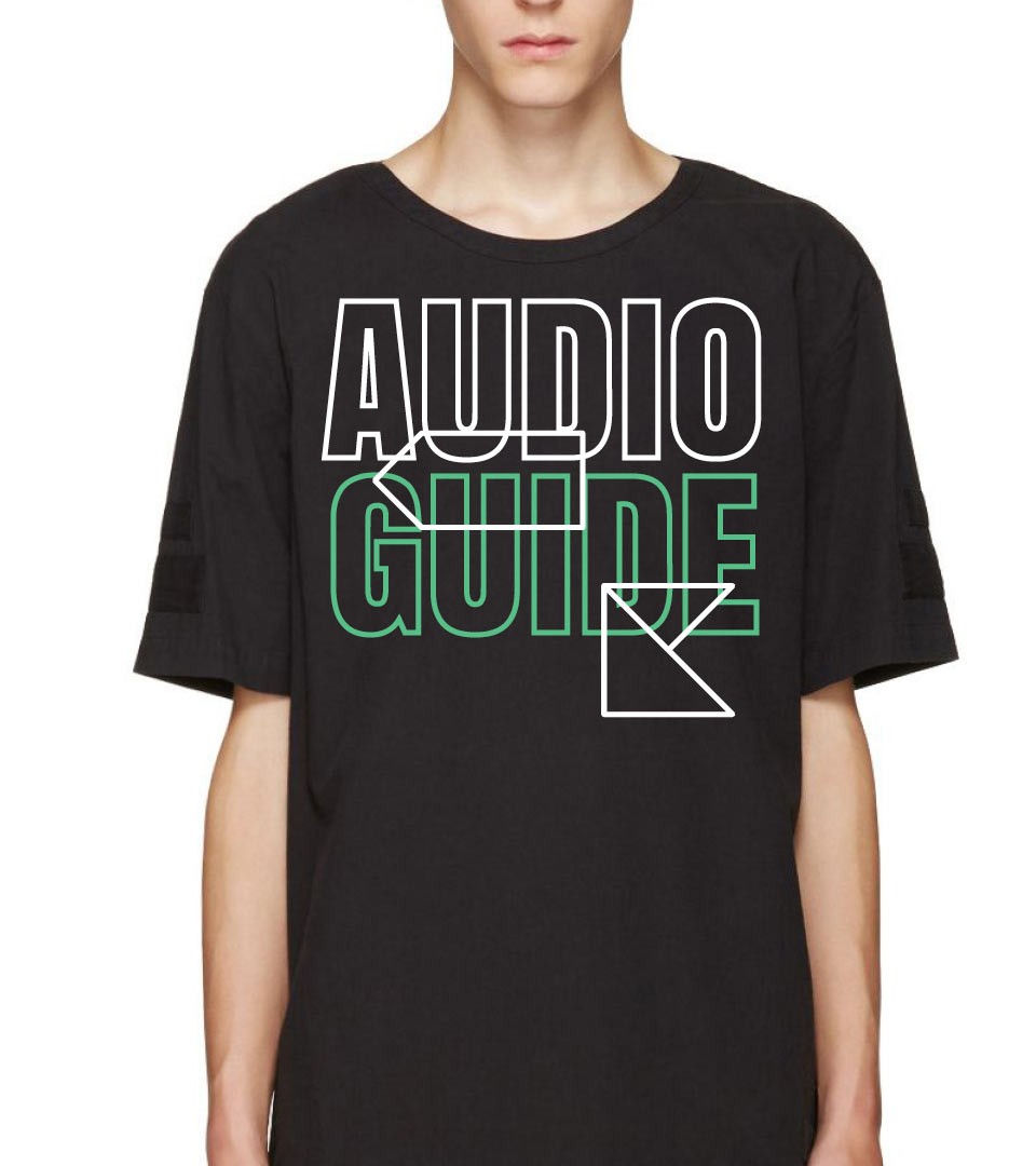
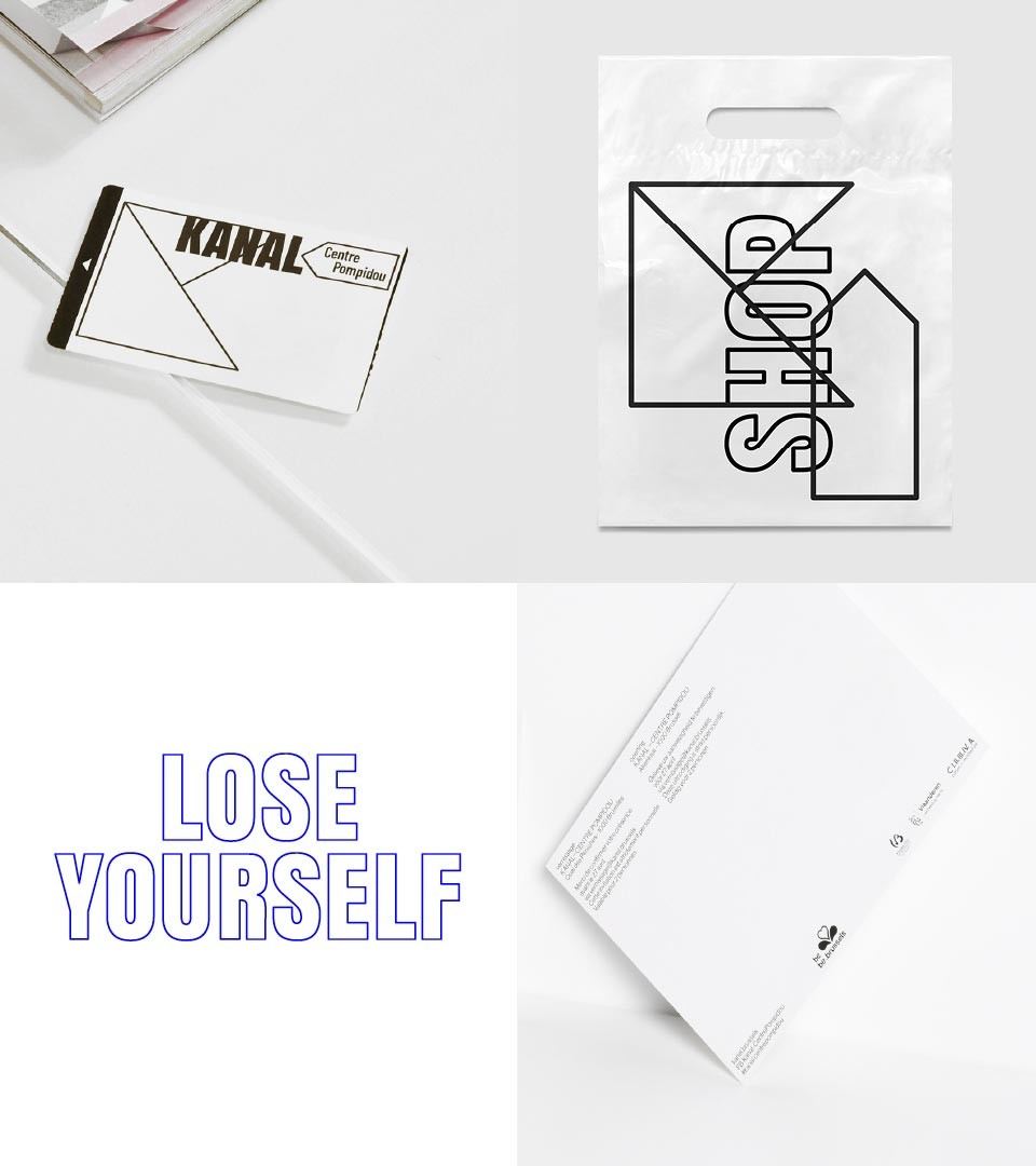
A communication system devised as a total approach
Using the custom typeface and colours to highlight content and space, the communication system was used inside and outside the building and on selected communication items like invites, workshops, specific performances. A straightforward identity guide with rules was also conceived.
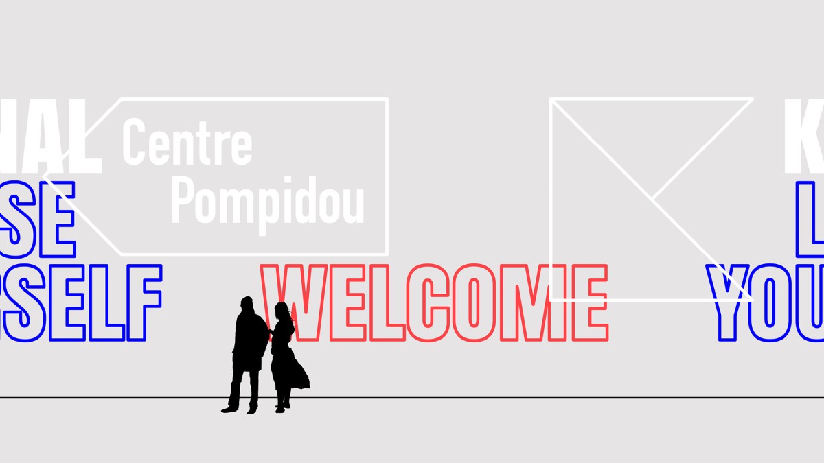
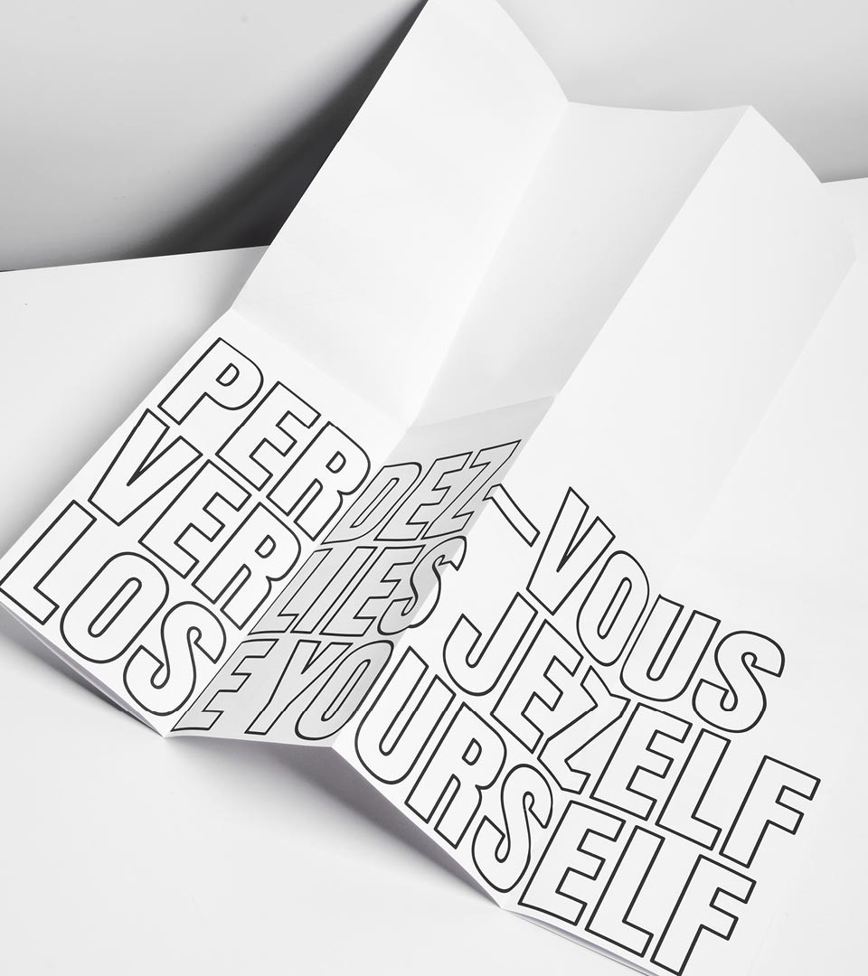
A great feeling of liberty
Everything played around the identity of the location. From great sentences like “Lose Yourself”, once said by Yves Goldstein the director of Kanal Centre Pompidou about its idea that visitors should get lost in its 35,000sqm space.
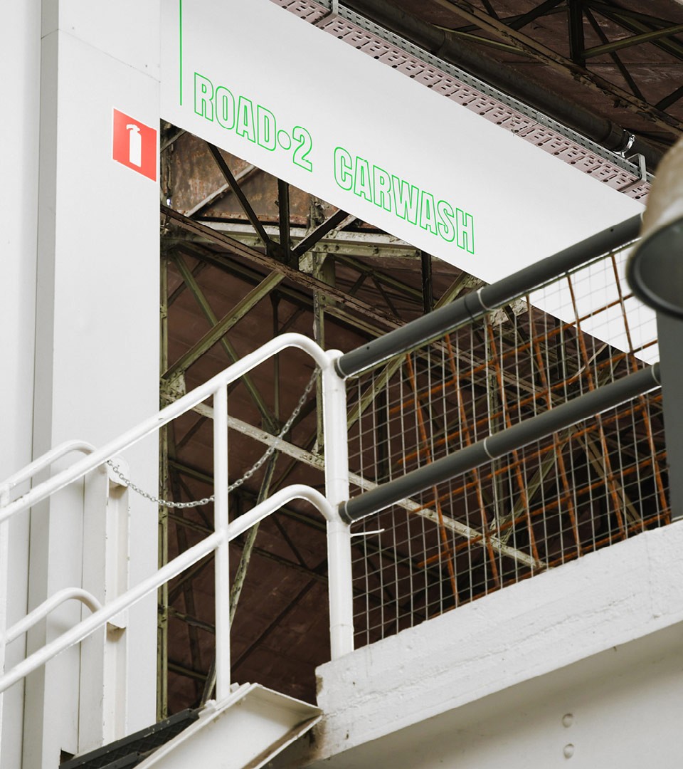
A low cost signage system
2 main decisions were made for this 35,000 sqm signage system : using the ground to mark the different routes of the exhibitions, and using large scale boards in forex to clearly identify the spaces within the institution. The result is a signage system close to the garage former state : Raw, informative & cheap to produce.
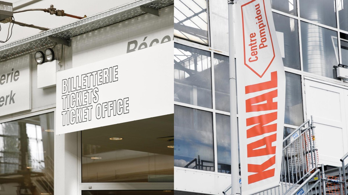
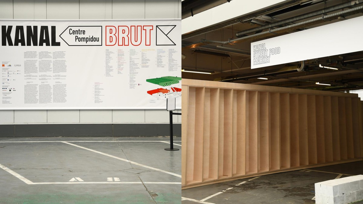
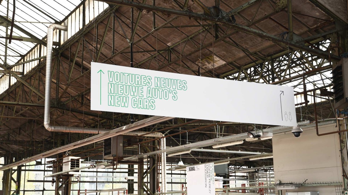
Two types of signage formats were devised : the directional & situasionists were big and bold while the artworks information boards were inspired by office corporate design. Like a reminder of the former factory & office state of Kanal Centre Pompidou.
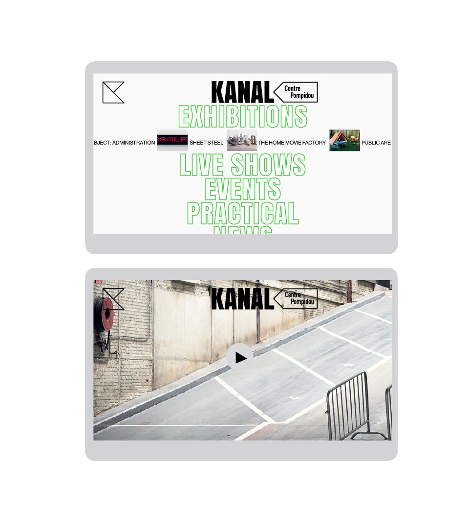
Digital look and feel
For the digital space of Kanal Centre Pompidou, our recommendations were exactly the same as the communication for print or interior : maximalise the area with an impactful textual integration of the identity as a bold statement.
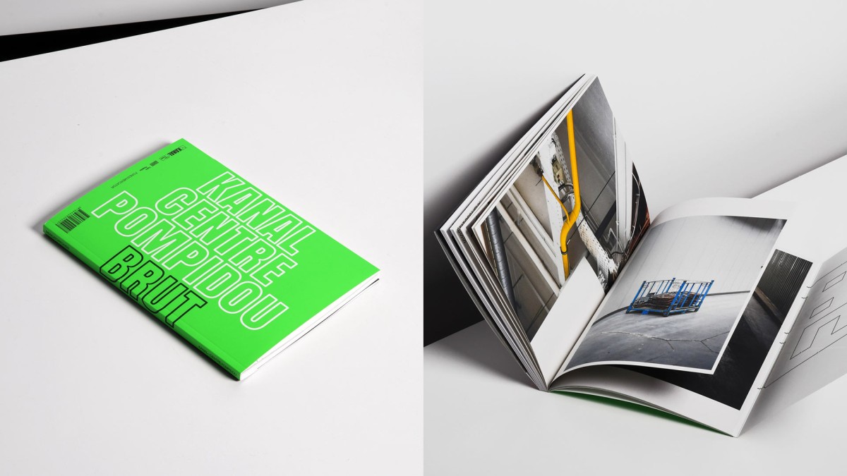
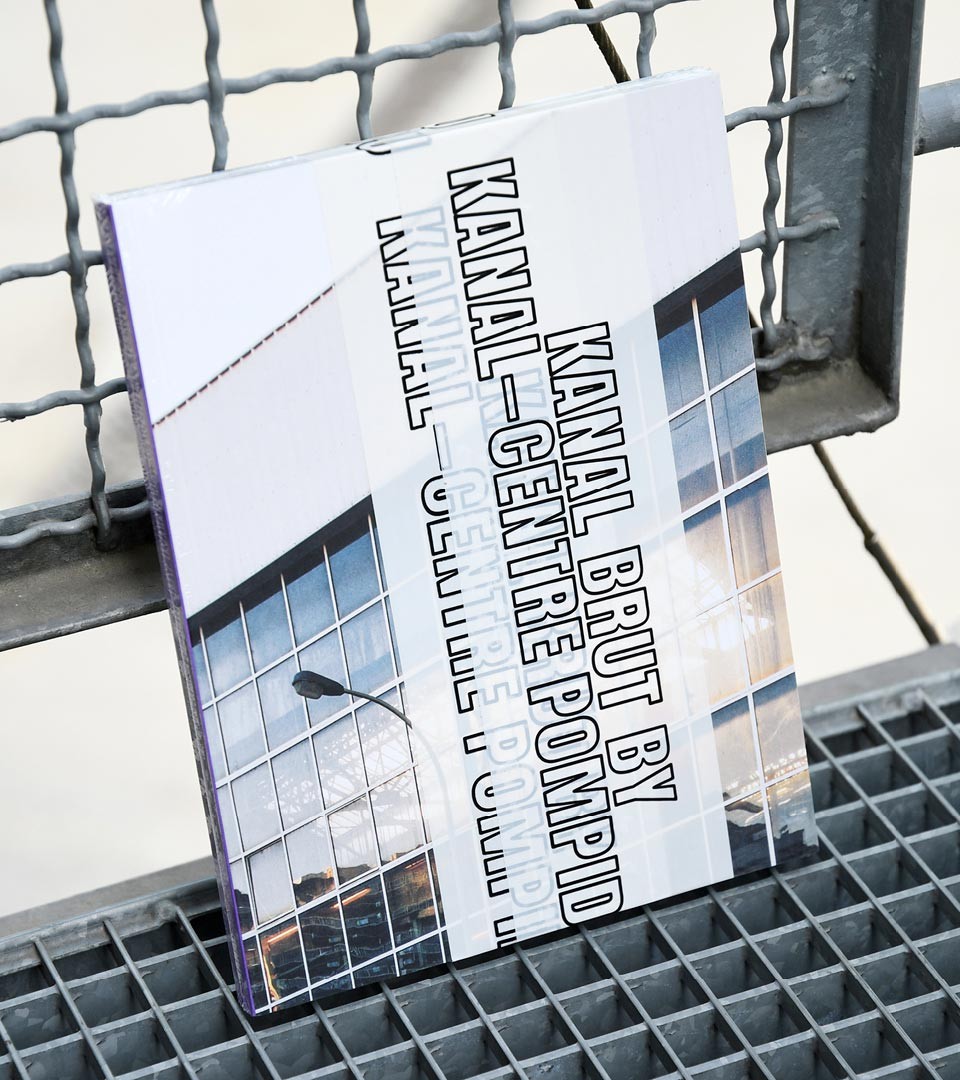
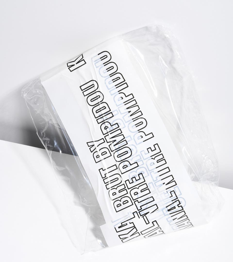
Two books have been released. We designed them as traces of a past. The first one was printed before the opening with pictures we took from the state of the location before exhibitions were installed, the second one as a trace of the exhibition, showing a year of creation at Kanal Centre Pompidou.