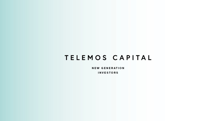
TELEMOS CAPITAL
— London based private fund
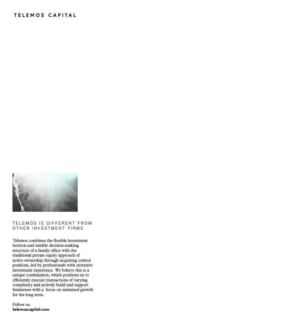
Founded in 2017 in London, Telemos invests in private European businesses, with the aim of building great companies for the long term. They seek to invest in high-performing, cash-flow generative and well-managed businesses with the potential for sustainable growth through international expansion, add-on acquisitions and/or operational improvements. We have created their identity and website.

Foreseeing the future
Telemos looks to deploy €50m-€200m of equity per investment, with an aim of building a concentrated portfolio of majority stakes in companies, supported by their active partnership approach. With experience and an entrepreneurial family heritage, Telemos Capital has a strong knowledge in business cases. Took from “Homer’s Odyssey, Book IX, 520” , their name “Telemos” was a prophet foreseeing the future.
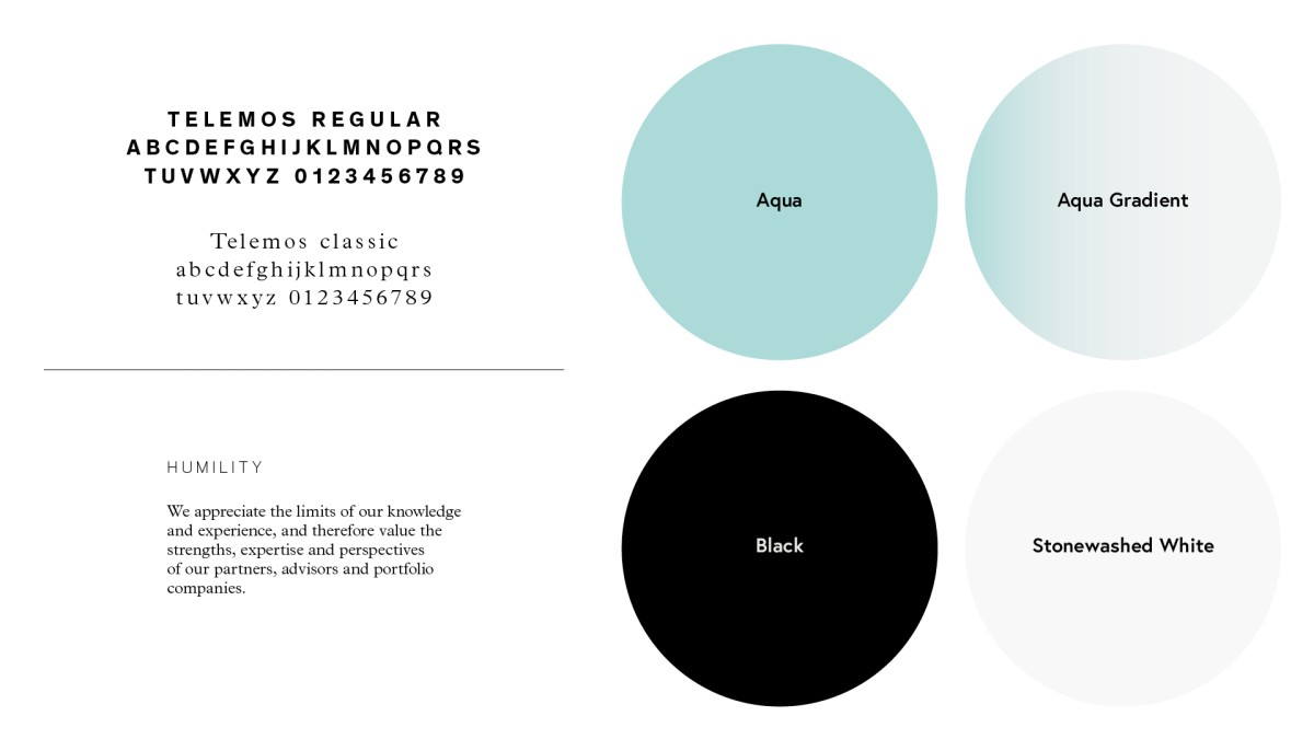
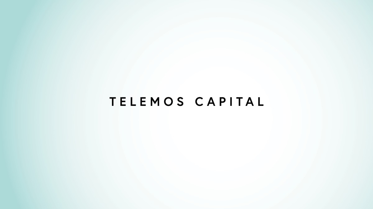
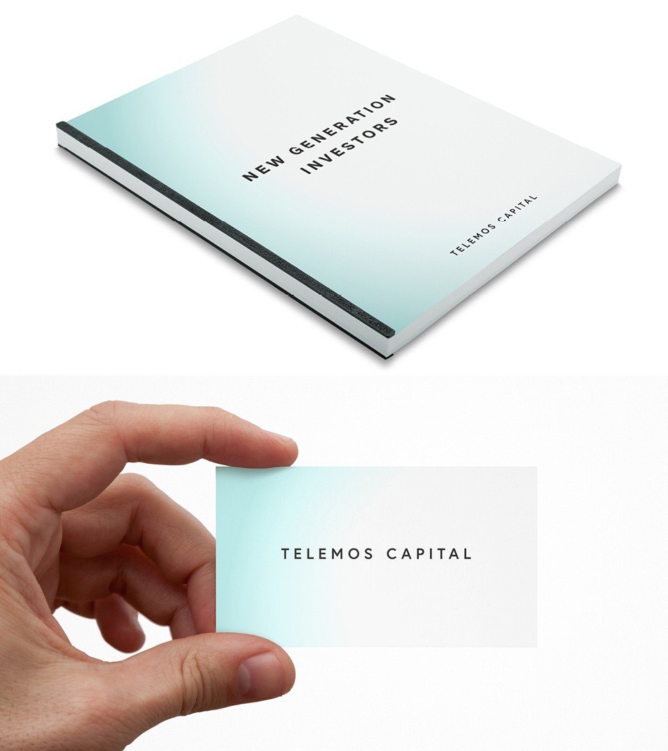
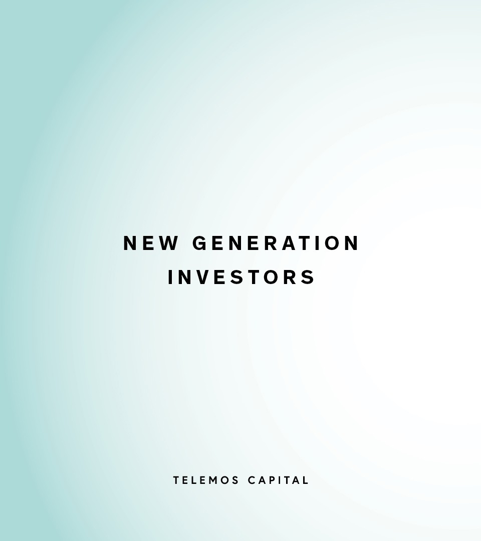
The color code of our branding approach was inspired by the odyssey oceans tones. The Telemos Aqua colour was created and worked like a watermark on the identity presence.

Telemos Aqua
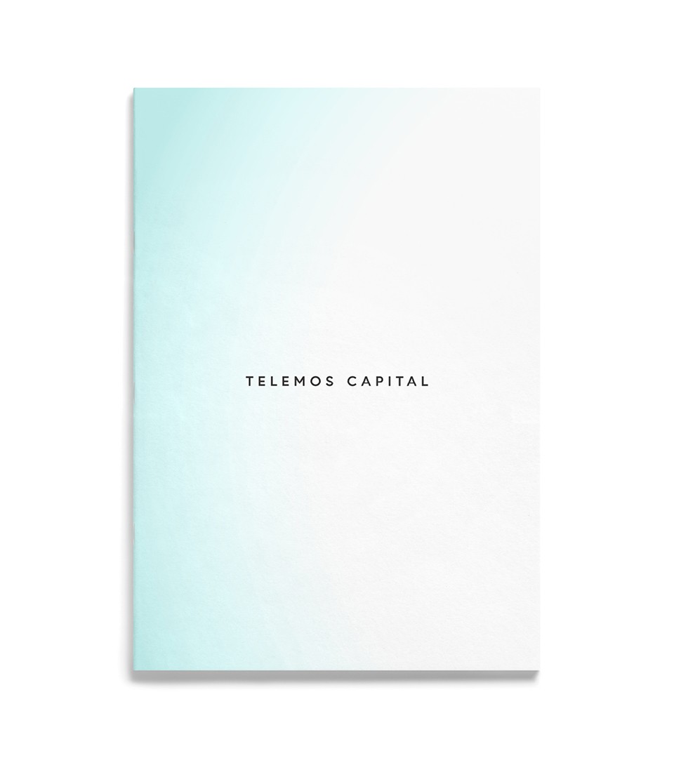
A light gradient from west to east was applied for the colour palette, using this colour code on a variety of items in digital and print.
Telemos Capital logotype
We selected a stylish and modern swiss-like typeface to build trust and deliver a controlled and restrained design-led aesthetic to match our playful colour palette.
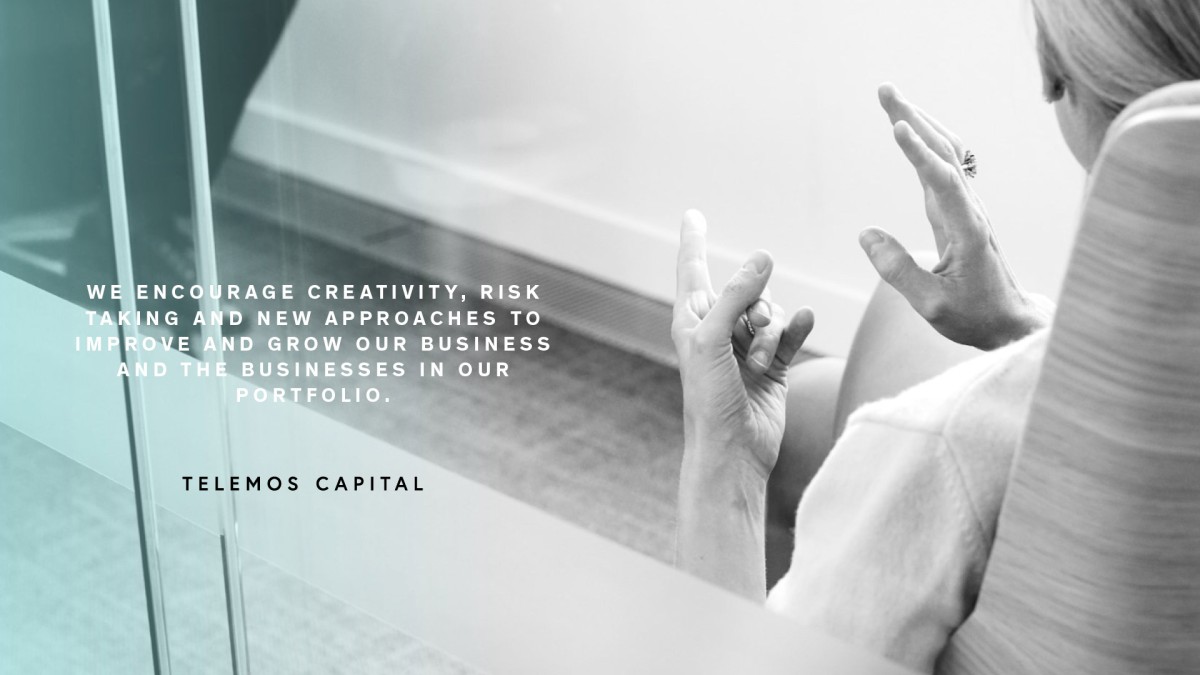
A subtle identity
Contrary to clichés, the identity is subtle and uses the Aqua gradient as a signature.
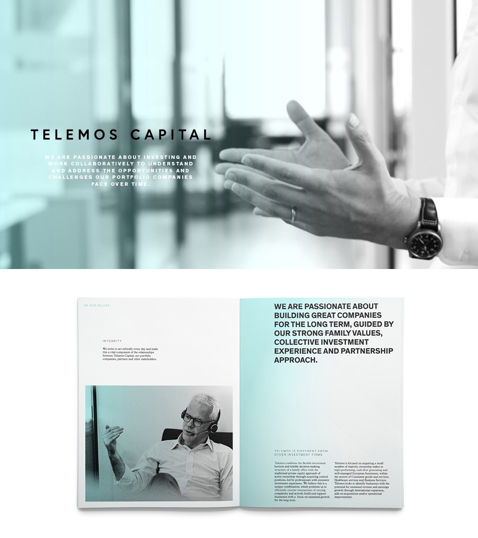
The website is the brand place with quick access to essential information. It was designed like an APP with most of the page layout seen without scrolling.