Fc Metz
Rebrand of Iconic French League 1 Football Club
Fc Metz is an icon. The club’s ambitions are found in a new stadium, a new training center and a new brand.
A rebrand for an iconic football club
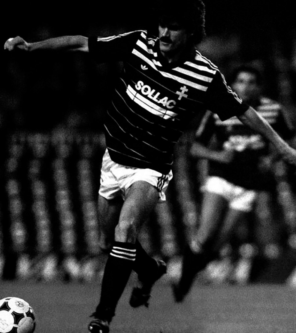
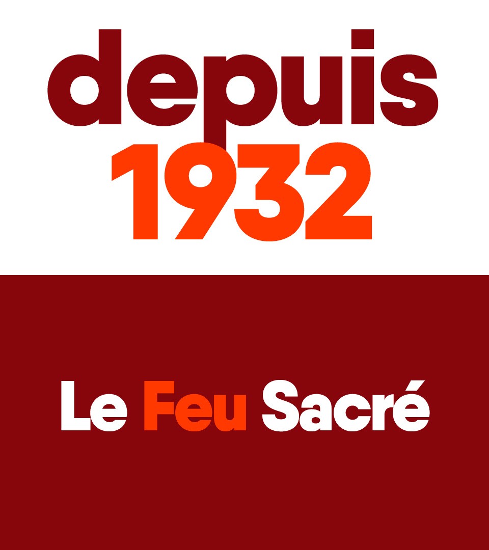
Founded in 1932, Fc Metz is part of those iconic french football clubs. They won the Coupe de France twice, in 1984 and 1988. The first of these victories enabled it to qualify for the European Cup Winners’ Cup where it achieved arguably the team’s greatest moment, an upset of FC Barcelona in the first round of the competition in October 1984. It lost 4–2 at home in the first leg but won 4–1 away in the return leg, making the FC Metz unique among the French teams who have beaten Barcelona at the Nou Camp. FC Metz also won the Coupe de la Ligue twice, in 1986 and 1996, and has made a total of ten appearances in European tournaments.
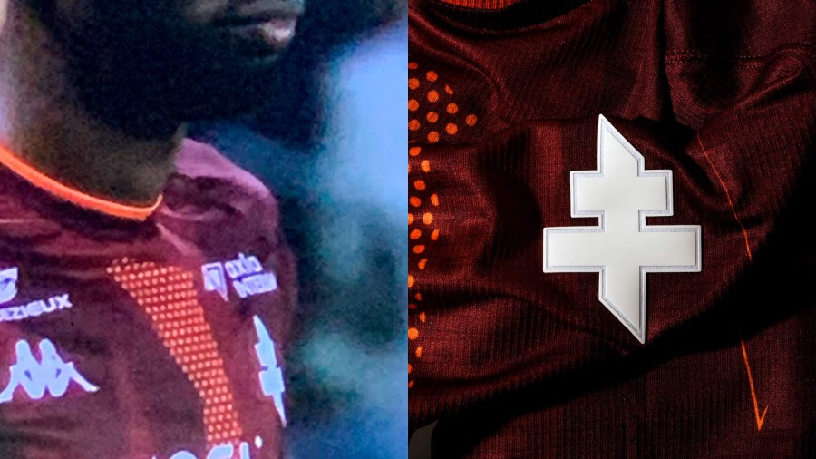
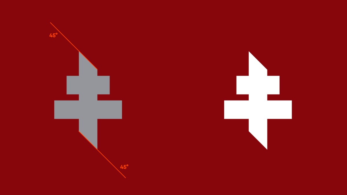
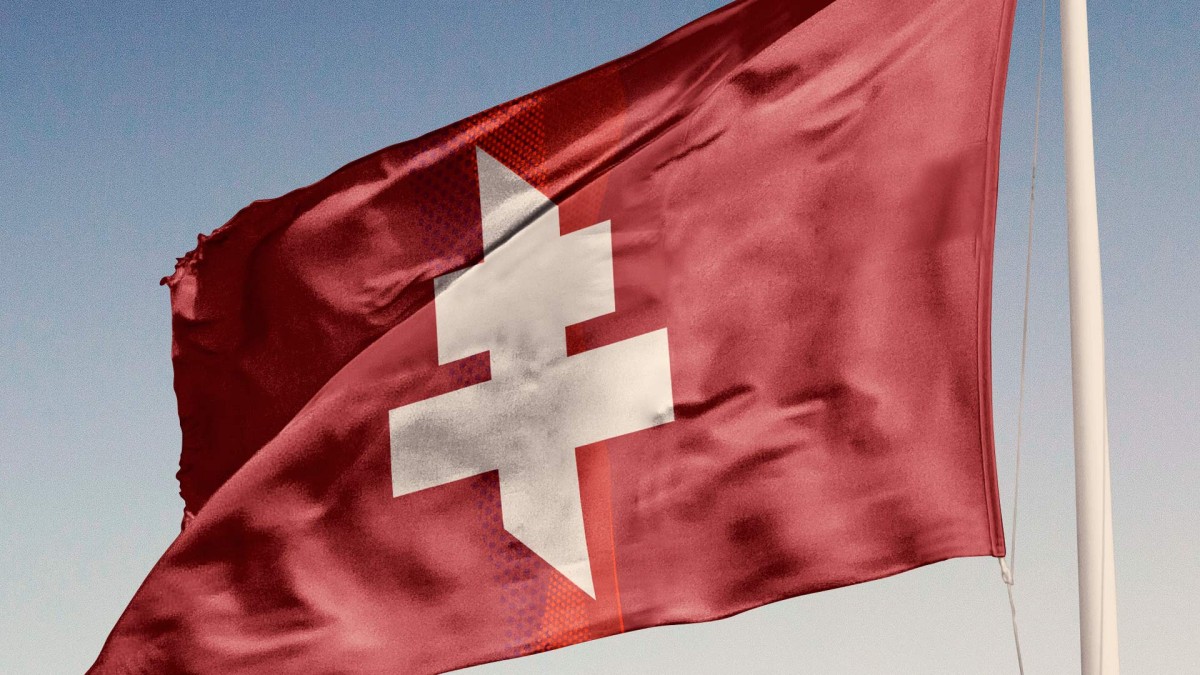
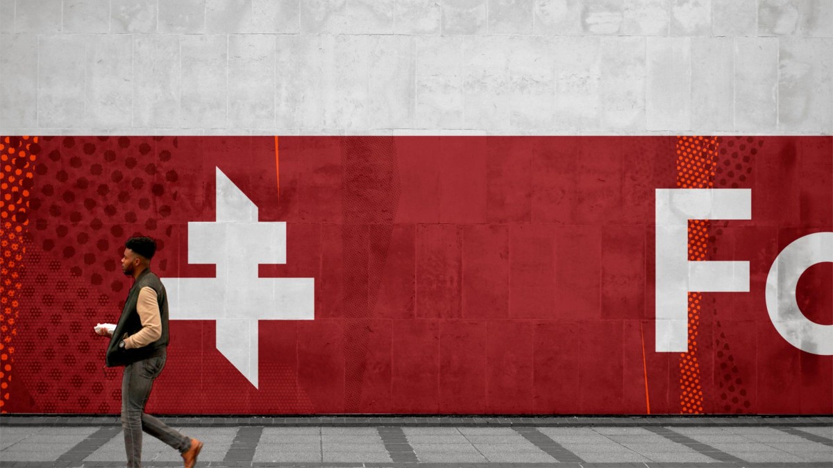
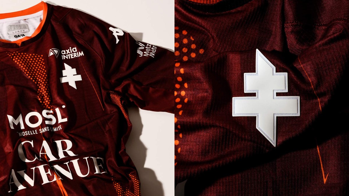
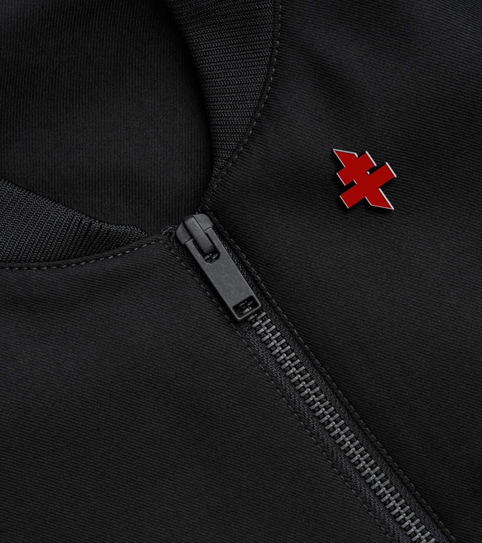
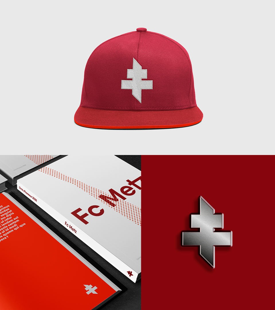
The Fc Metz is the only sport association allowed to wear the Lorraine Cross as emblem. To reinforce the club’s originality and link to the region, we’ve created their original Fc Metz Cross version. The fusion of sport & origin.
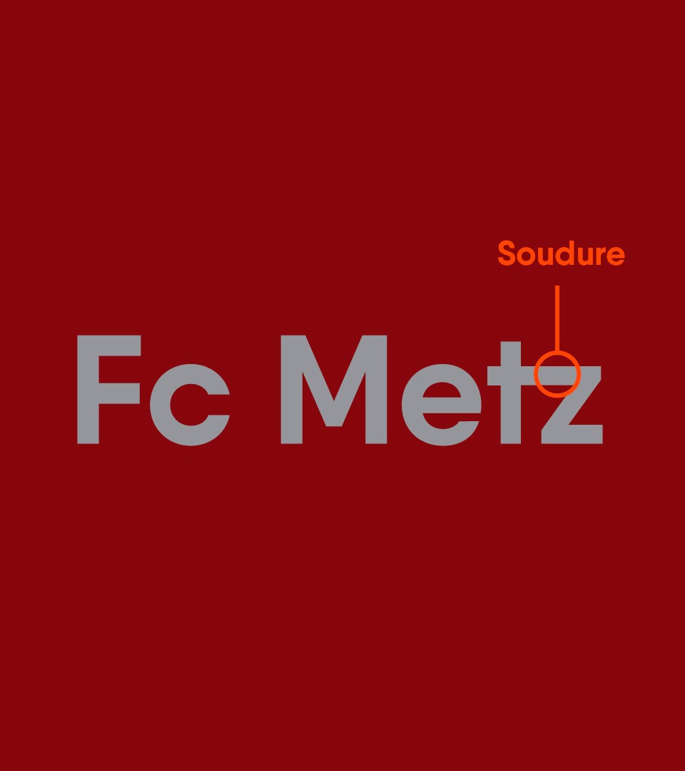
The Fc Metz cross
The Lorraine cross, symbol of a region, of its fervor, of its commitment and of its past, was personalized for the club. Without denying its origin, this cross of Lorraine symbolizes the energy, dynamism and modernity of a club which proudly bears its emblem, for its region, for its city.
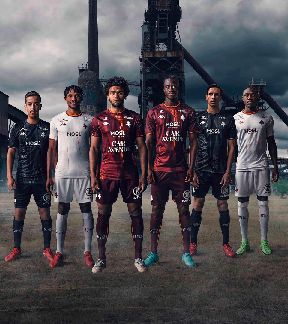
Grenat is the historical colour of the club. We’ve introduced an energetic fire orange, bringing the story of the industrial region in the brand.
The fire within the region, the industrial past, the reference to the clubs history : all of that played a role in bringing the identity to a dynamic level. Energyzing the players, the supporters and the region in a modern way.
A perforated metal-like pattern was designed to reinforce the link between the industrial region and the club.
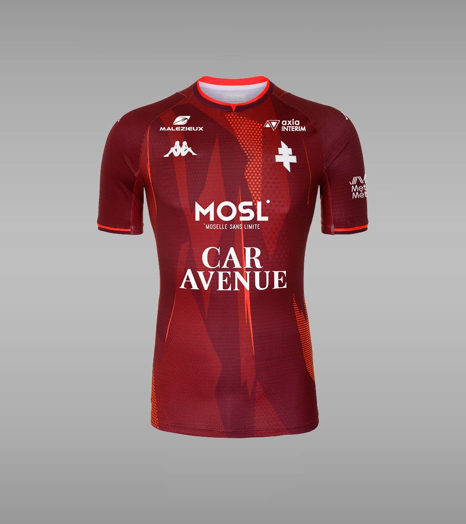
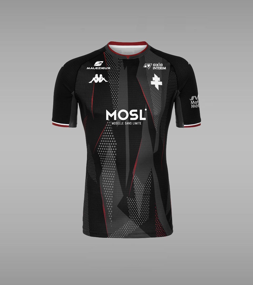
A shield ready for victory
The Cross, the metal pattern, the fire whitin the players. All of this is present in the new football club shirts. Developped with the internal design team of Kappa Sportswear, the new equipment is bold like a shield.
A world of energy
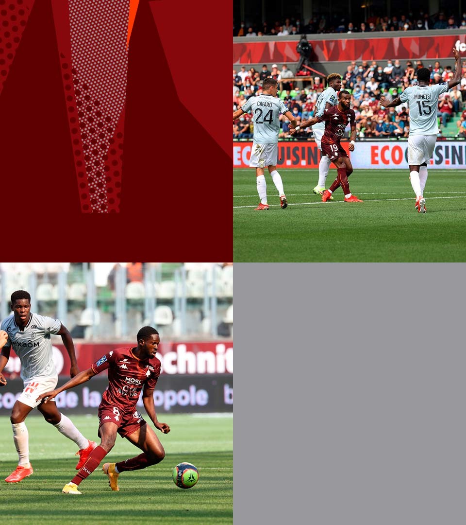
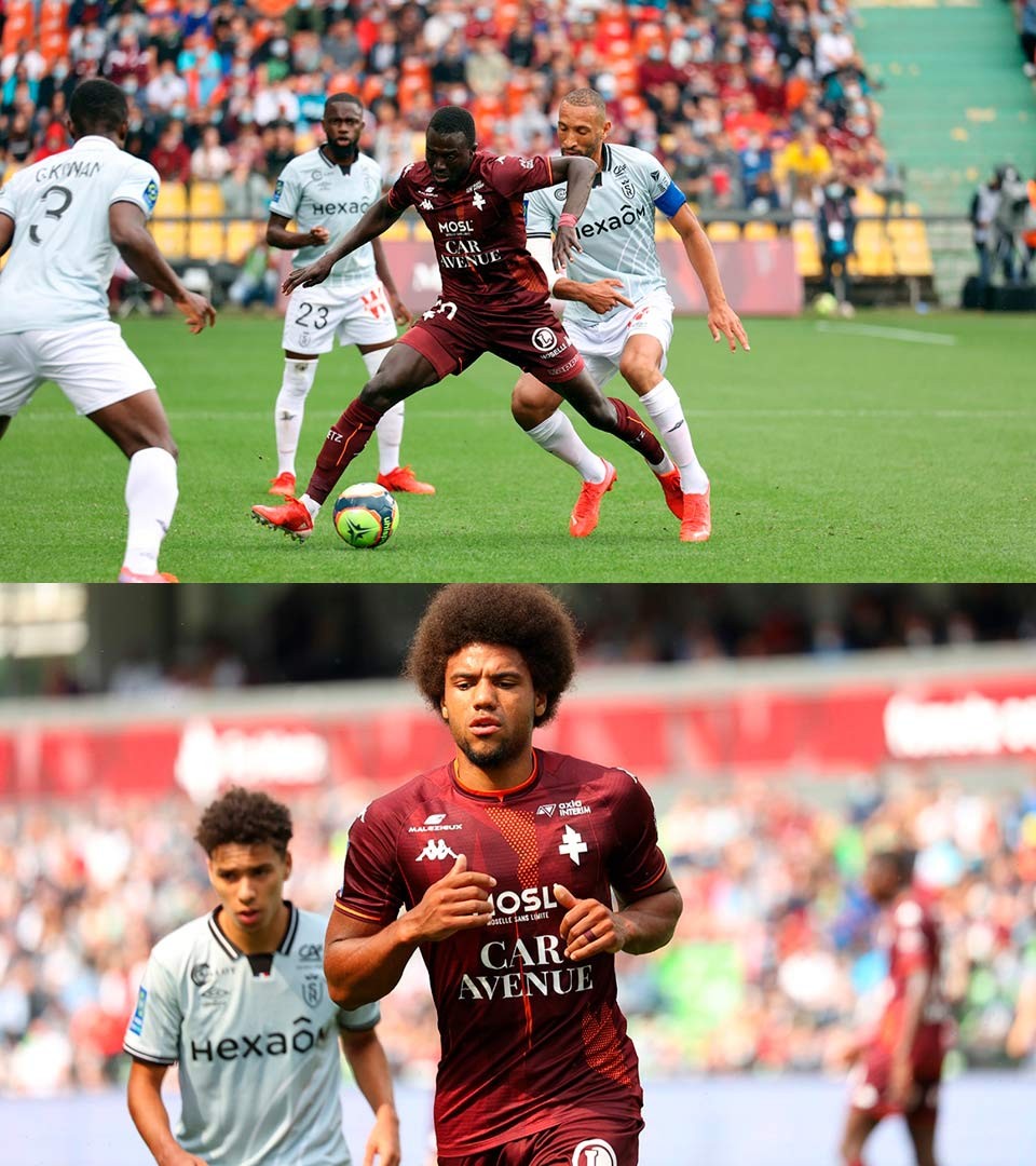
The full rebrand is about injecting in all of the clubs presence the story of fire within the players, the supporters and the region. For this, many design implementations have been created, allowing the club to communicate on all platforms and for all audiences.
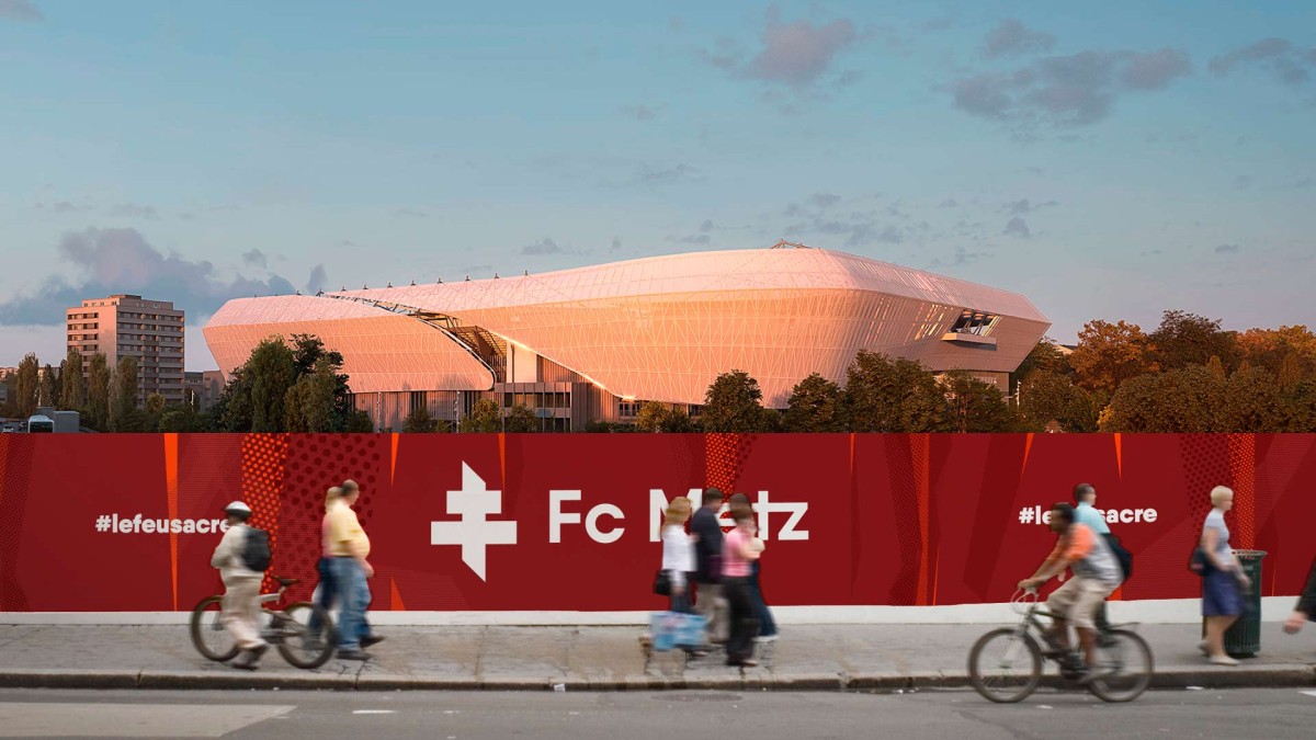
The brand is a strong ambassador of a city, bringing together the city of Metz, the citizens of Lorraine and the ambitions of a club that goes way beyond its region.
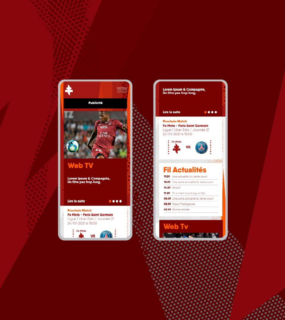
A graphic chart to make it happen
Designed as a flexible system, the identity of Fc Metz is a combination of a strong logotype and a variable pattern. Together, they form the vivid and ever changing identity, like a burning fire.