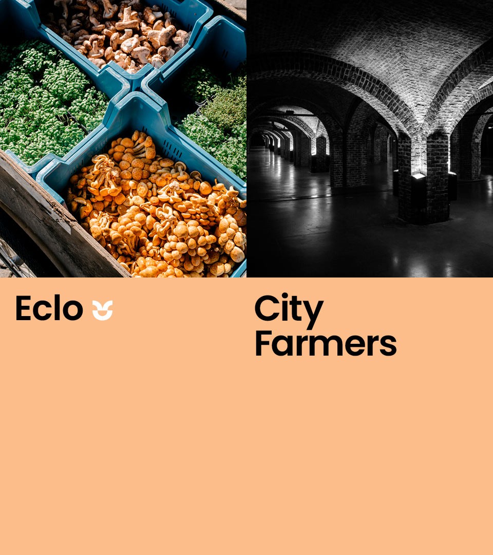
Eclo
Branding for City Farm
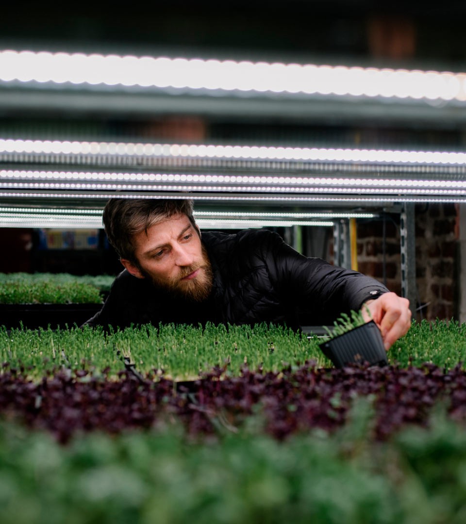
City farms are a simple way of being closer to one’s own food. It’s also a way to improve community relationships and offer an awareness of agriculture and farming to people who live in urbanized areas. Eclo is all that, specializing in mushroom and micro greens production.
From “Le champignon de Bruxelles” to Eclo
Formerly known as “Les champignons de Bruxelles”, the new name “eclo” evokes “hatching”, which is a better definition of their production including mushrooms and micro greens. In 2021 they produced 74 tons of Fresh mushrooms and 84,000 units of micro-greens. The brand is also at the forefront of city change : their production uses food waste and use bikes to deliver their production.
The Eclo Buddy, a smiling and growing seed

The Eclo Buddy : Positive production and positive purchase
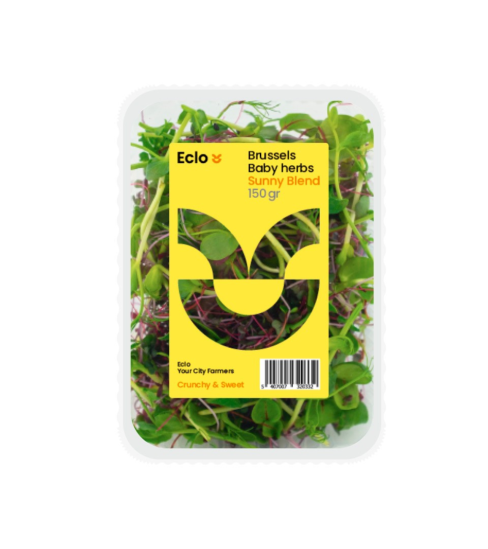
Building on the brand values and products, we translated the strategy into a positive character. This character was designed as a “smiling and growing seed” constructed from the logotype “O”.
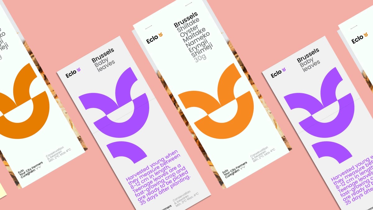
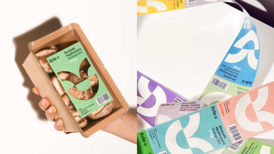
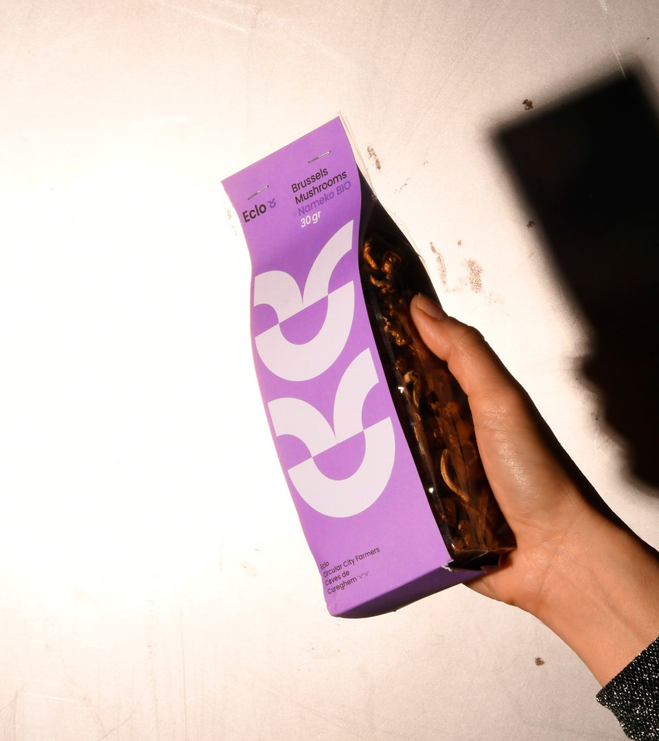
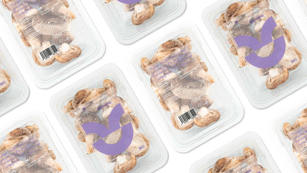
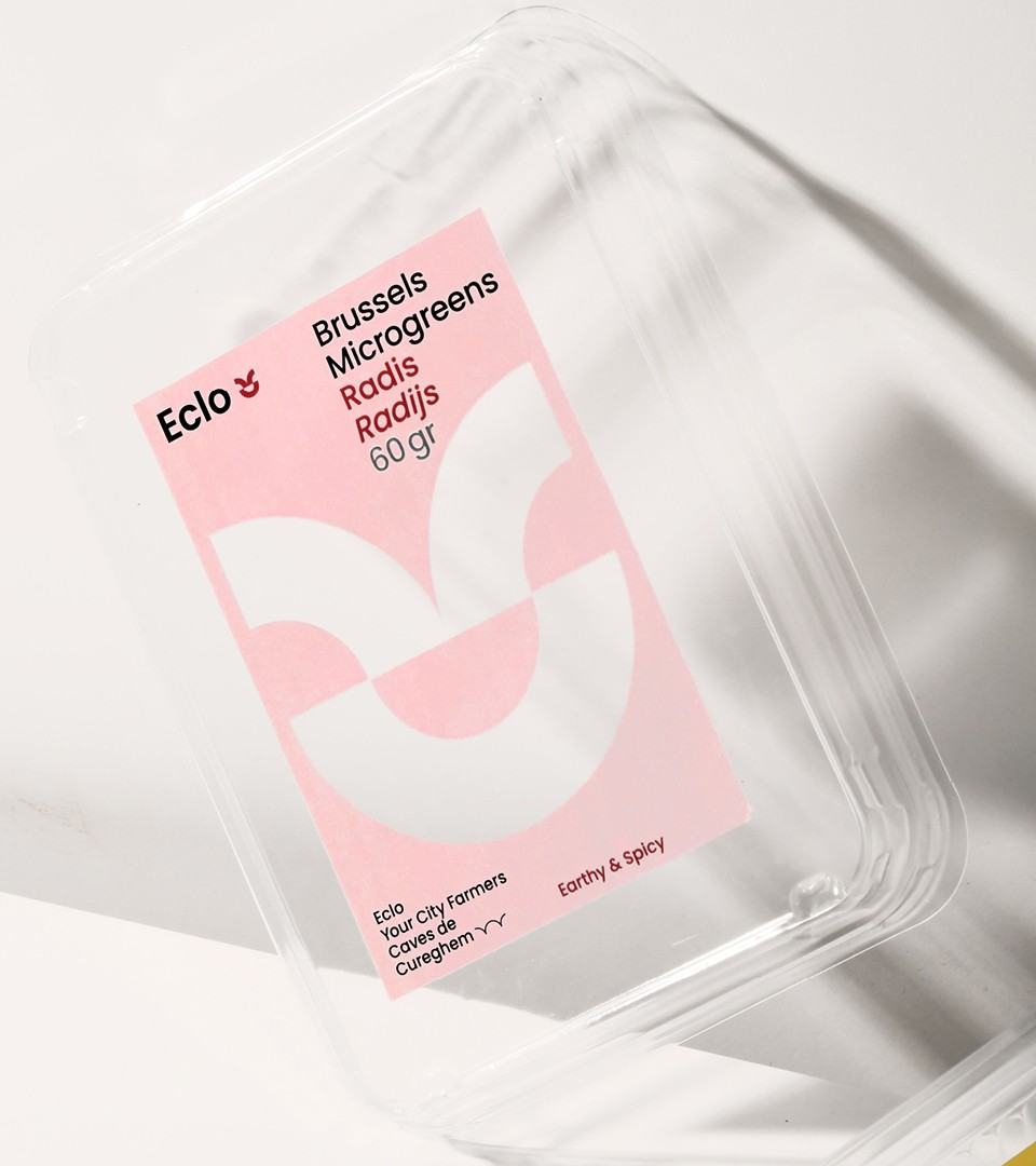
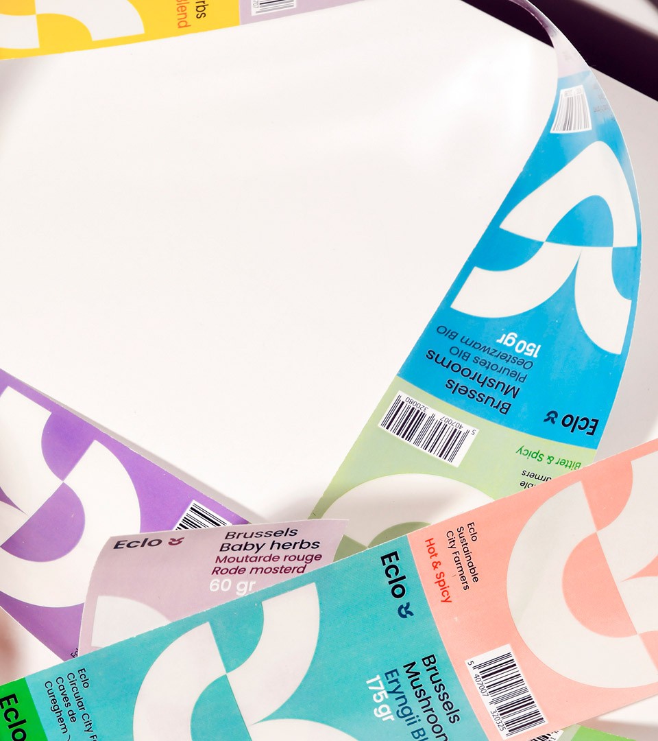
The Logotype represents a growing and smiling seed. An extended color code is applied to their versatile collection of products.

"We've asked COAST to rebrand Eclo with a simple, yet strong, concept that could embrace the playful, urban & local vision of our company. The work done by their team challenged us to a point we didn't imagine. Their creative approach offered us a coherent & joyful brand universe, from logo to packaging."
— QUENTIN DECLERCK, Managing Partner Eclo
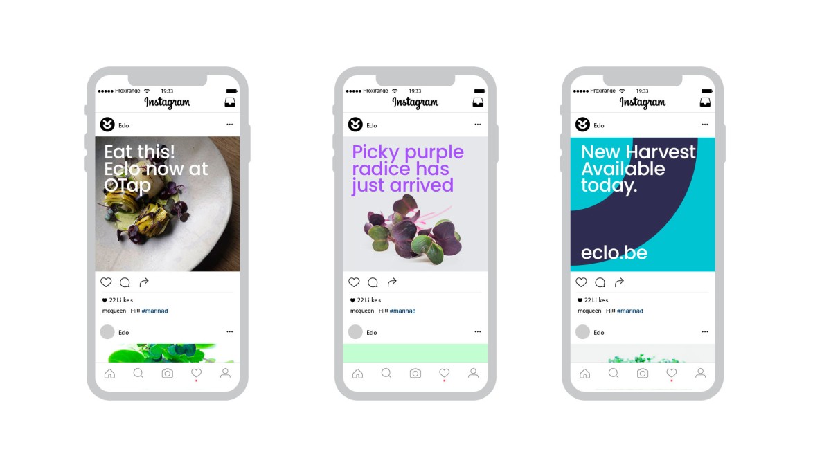
With a low tech / low ecological impact packaging and a tone of voice far away from traditional players, the brand is part of a new positive and progressive attitude for a booming sector.

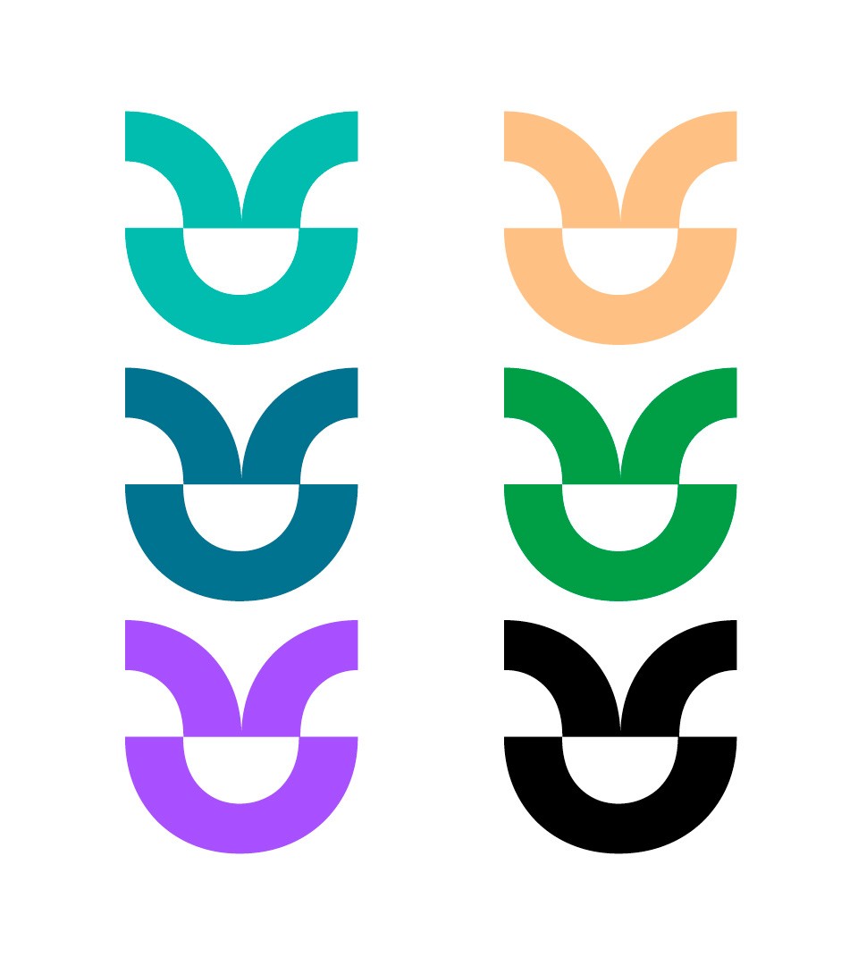
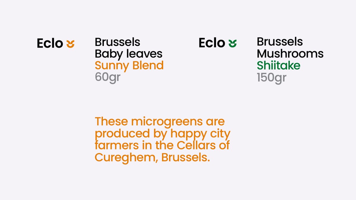
Logotype color code
The variety of products and their own shelf presence conducted in creating a specific color for each product. Each product of the Eclo family has its own color code and is applied on the logotype itself.